Product design · Built with Claude Code
Beacon
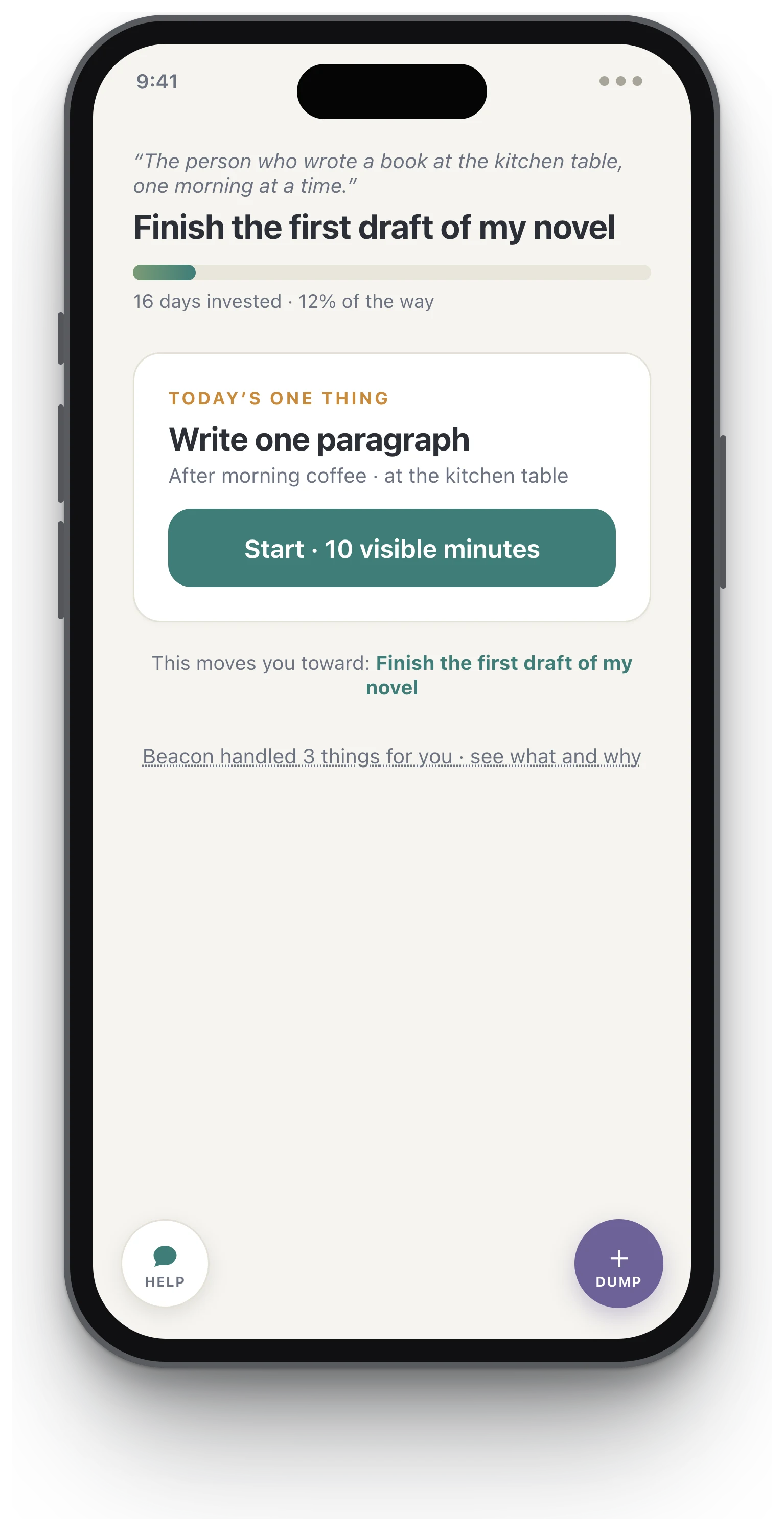
- Duration
- July 2026 – present (personal project)
- My role
- Product strategy, research synthesis, and product design
- Team
- Solo
- Context
- A mobile app that helps adults with ADHD accomplish long-term goals. “Beacon” is the working name.
- Tools
- Claude (research synthesis and product strategy), Claude Code (working prototype), Claude API (the agentic layer’s live backend)
Productivity apps quietly assume a neurotypical brain: distant rewards motivate, streaks encourage, and a missed day is useful feedback. For an ADHD brain, every one of those assumptions is backwards. Beacon starts from the research instead: one long-term goal, converted into tiny daily habits, inside a loop designed to forgive. I synthesized the clinical and behavioral evidence, distilled it into five design laws, and built a working 12-screen prototype in which every screen has to obey them.
The real problem
The ADHD productivity category has a graveyard pattern: apps work for two weeks, then die around day 30. The mechanism is well documented in user post-mortems. A streak breaks, the app shows a wall of red Xs, shame does the rest, and the user never reopens the app. “My 64-day streak broke and I never opened it again” is a typical story, not an edge case.
Meanwhile the category splits the job in half: habit trackers give you a daily loop with no connection to anything long-term, and goal apps hold the long-term goal but give you no reason to open them today. Nobody holds both ends of the thread.
The research
Before any screens, I researched why these tools fail, using Claude to run and structure a synthesis across neuroscience, clinical trials, behavioral economics, and lived-experience accounts. The findings that shaped the product (figures as reported in the literature):
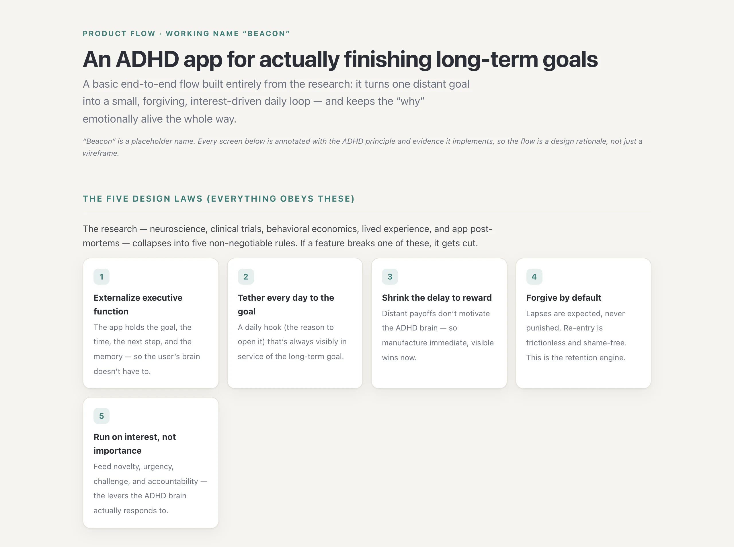
- If-then plans work unusually well for ADHD. Implementation intentions (“after coffee, at my desk, I write one paragraph”) show an effect size of d≈0.65 on goal attainment in Gollwitzer’s research, strongest in people with impaired self-regulation.
- Mental contrasting multiplies effort. WOOP (Wish, Outcome, Obstacle, Plan) roughly tripled goal-directed effort in a randomized trial.
- Distant rewards barely register. ADHD shows steeper delay discounting (d≈0.43) and reduced reward anticipation in the ventral striatum. The payoff has to arrive now, not at the finish line.
- Time blindness is real. Barkley’s “now vs. not now”: time that is not visible does not exist.
- Rigid streaks backfire; repair mechanics retain. Forgiving mechanics measurably raise reactivation. Duolingo’s load-bearing retention feature is the streak freeze, not the streak.
- Shame is the churn mechanism. Rejection-sensitive dysphoria turns one missed day into permanent abandonment; self-compassion framing is a retention mechanism, not soft copy.
- Motivation follows interest, not importance. Dodson’s INCUP (interest, novelty, challenge, urgency); body doubling is the most-credited real-world ADHD strategy; future-self continuity is weak, which is why distant goals do not pull.
The synthesis is captured in an annotated flow document that maps every screen to the evidence it implements. Two frames from it are below; the full document is readable here.
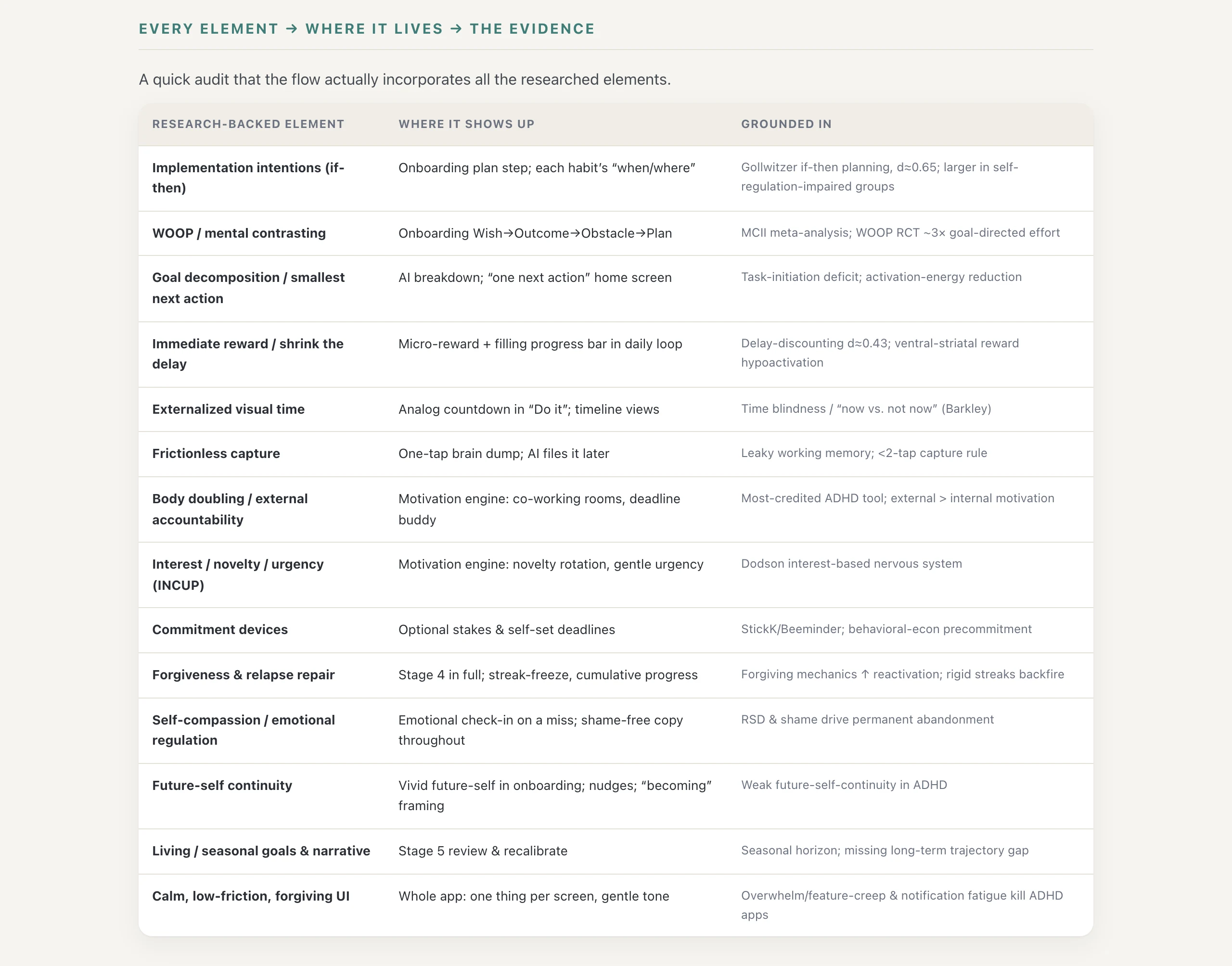
The synthesis collapsed into five design laws. Every screen, feature, and line of copy must obey them; if a feature breaks one, the feature gets cut.
- 1. Externalize executive function. The app holds the goal, the time, the next step, and the memory. Never the user’s brain.
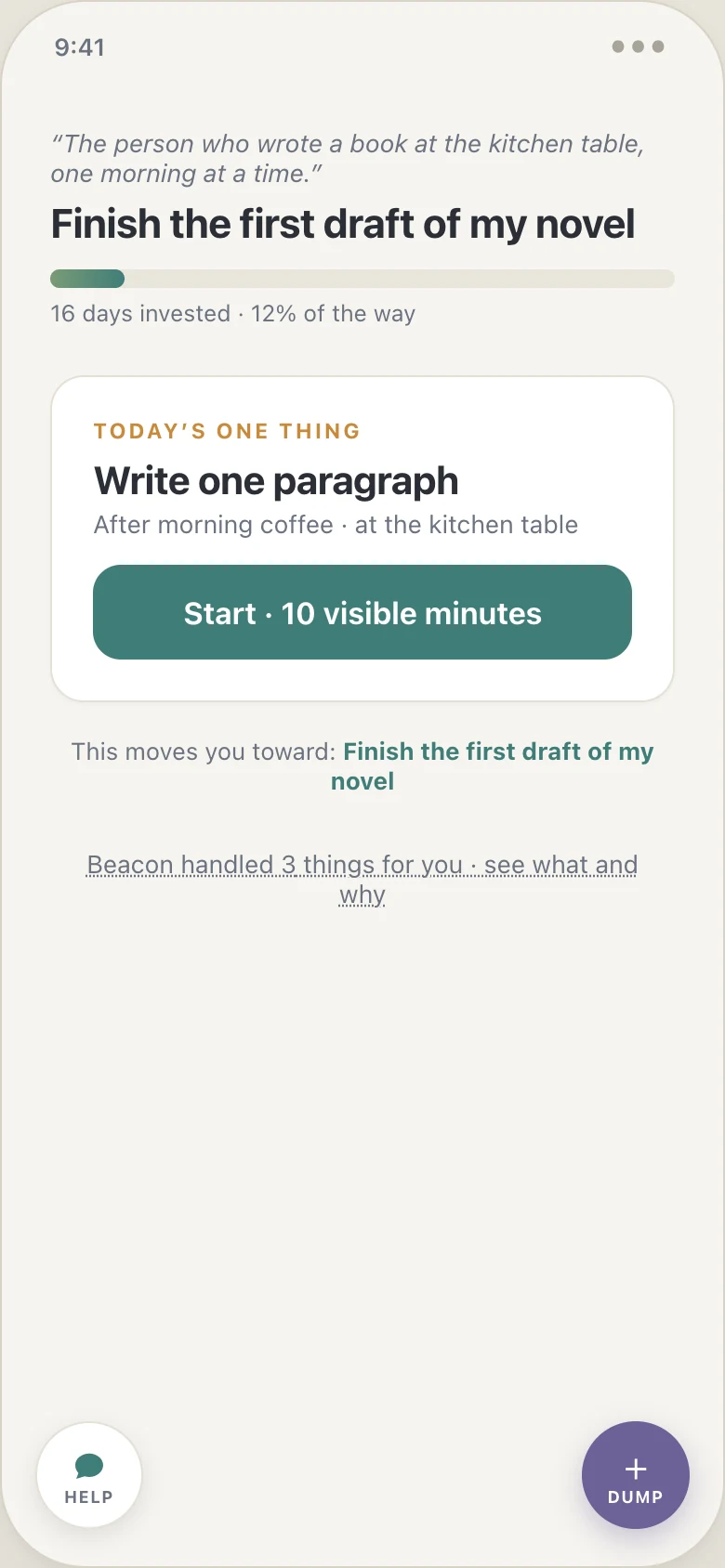
- 2. Tether every day to the goal. The goal and the user’s own future-self line sit on the home screen every day, and every completed habit visibly moves a cumulative indicator toward the goal.
- 3. Shrink the delay to reward. An immediate micro-reward on every completion; progress is visible and cumulative.
- 4. Forgive by default. A missed day never resets progress to zero. Re-entry is one tap and an absurdly small restart.
- 5. Run on interest, not importance. Feed novelty, urgency, challenge, and accountability. Never lecture the user about why the goal matters.
Decision 1
One goal, not a goal manager
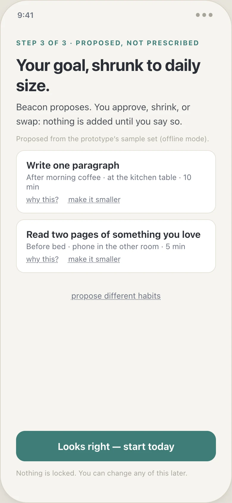
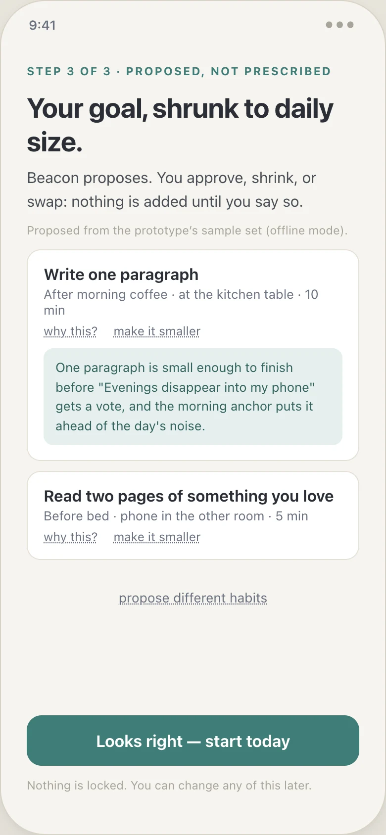
The obvious product is a flexible multi-goal system; that is what most competitors build, and a blank “what are your goals?” screen is exactly where ADHD users quit. Task-initiation paralysis is triggered hardest by open-ended decomposition work. I rejected multi-goal onboarding entirely: you pick one goal, WOOP it (wish, outcome, obstacle, if-then plan), attach one line about your future self, and the product proposes 1–3 tiny daily habits with if-then triggers that you only approve. The hardest executive-function work in the app is done by the app. Onboarding reaches a first completed micro-action in under two minutes, with no account wall.
Decision 2
Cumulative progress, not streaks
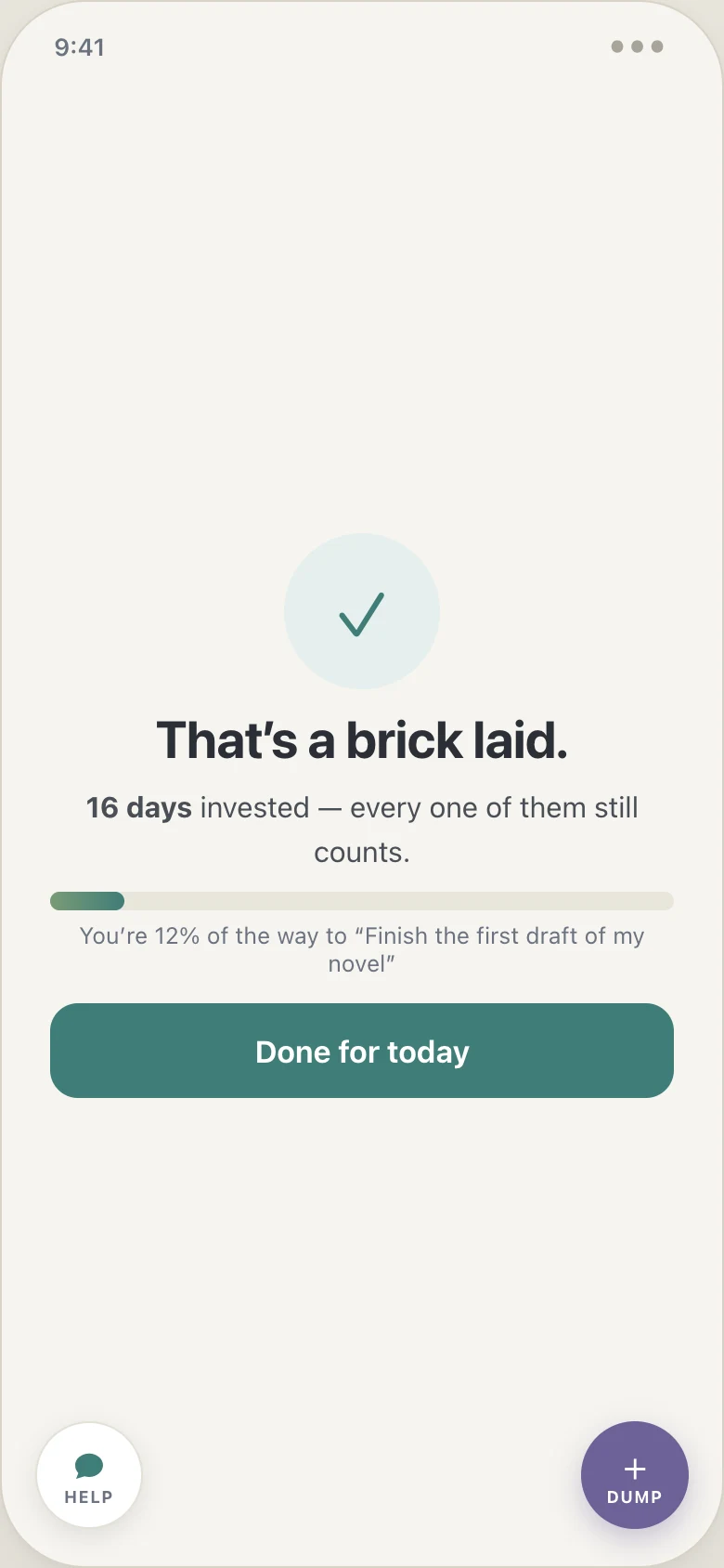
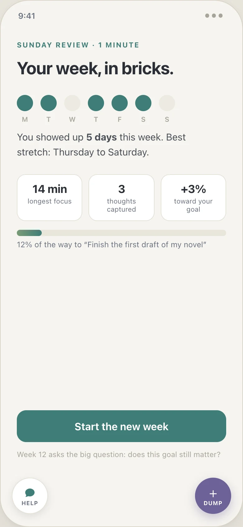
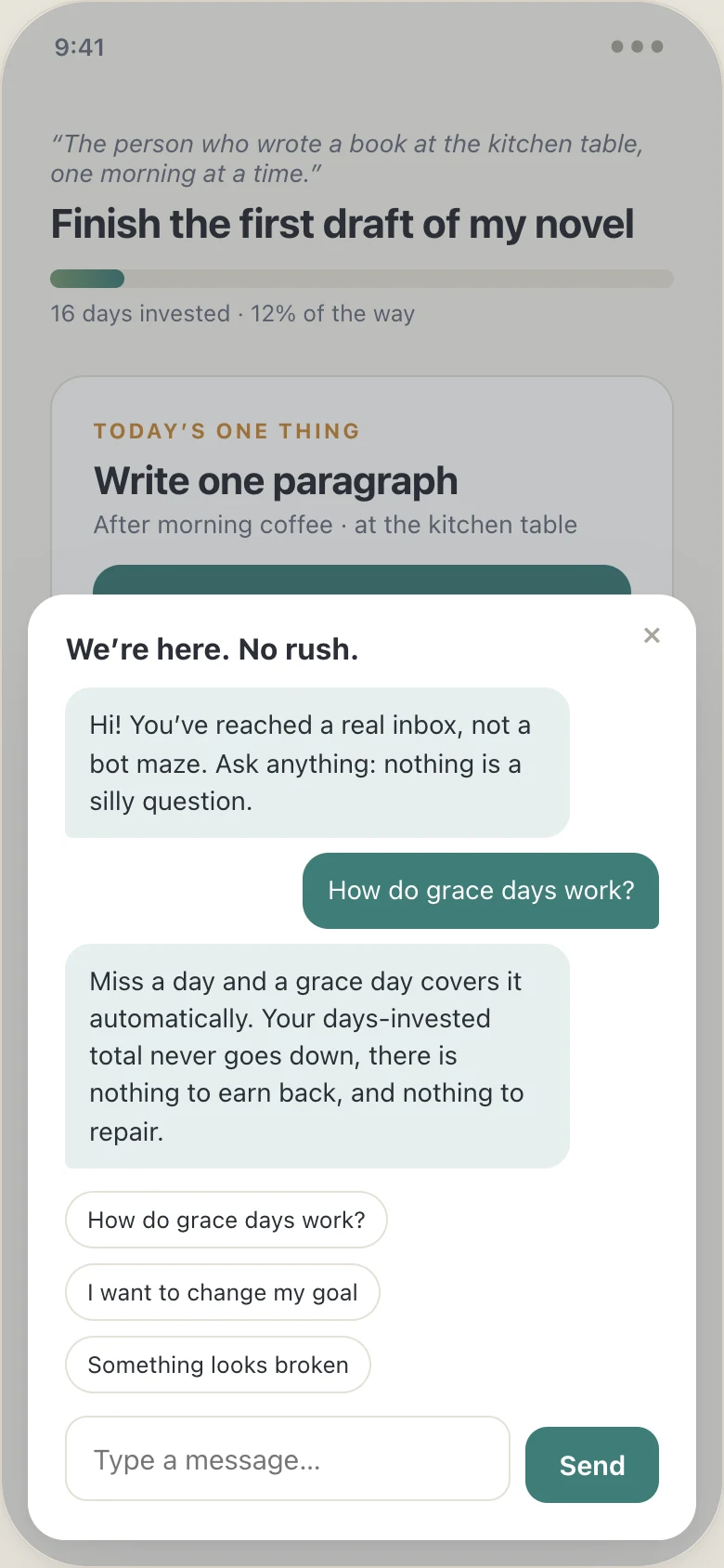
Streaks are the engagement engine of every competitor, and the research says they are also the documented abandonment trigger: an all-or-nothing chain plus one missed day equals a permanent quit. Beacon counts up instead. Progress is “16 days invested,” a number that cannot go backwards; a missed day consumes an automatic grace day; the copy says “welcome back,” never “you failed.” The trade is deliberate: less day-to-day pressure in exchange for surviving the day-30 cliff, because the pressure is the churn mechanism.
Decision 3
Time as a shape, not a number
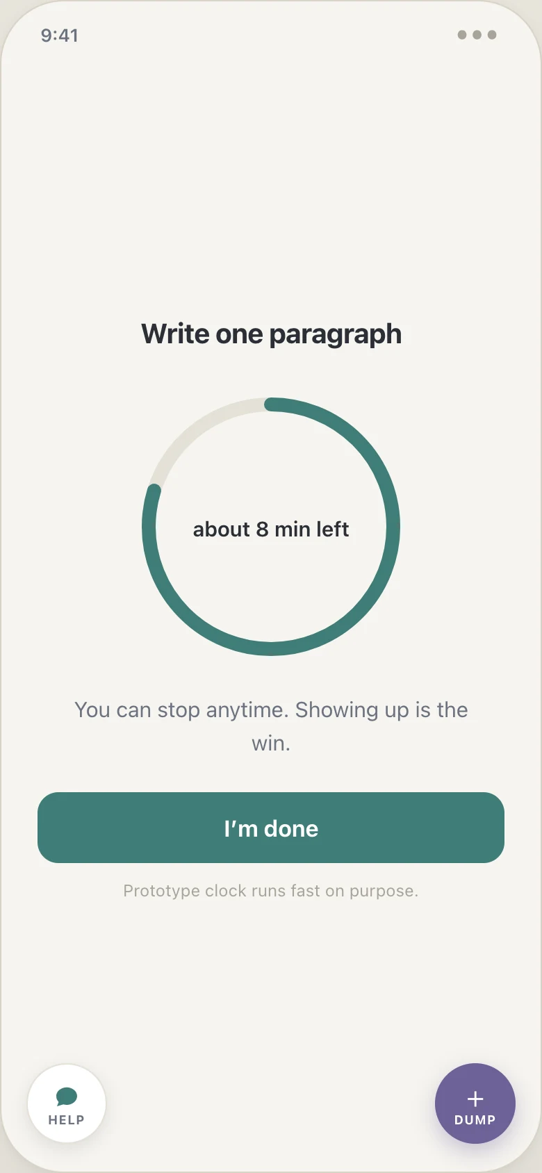
A digital countdown assumes the number means something to you. With time blindness it does not. Every duration in Beacon is analog first: a focus session is a ring that visibly shrinks, remaining time reads in words (“about 8 min left”), and the home screen sells the session as “10 visible minutes.” Digits-only time displays were rejected outright; they are the design equivalent of explaining a color by its wavelength.
Decision 4
The missed day is a designed flow, not an error state
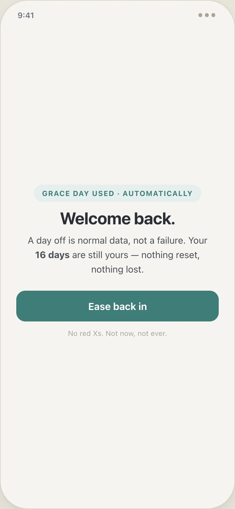
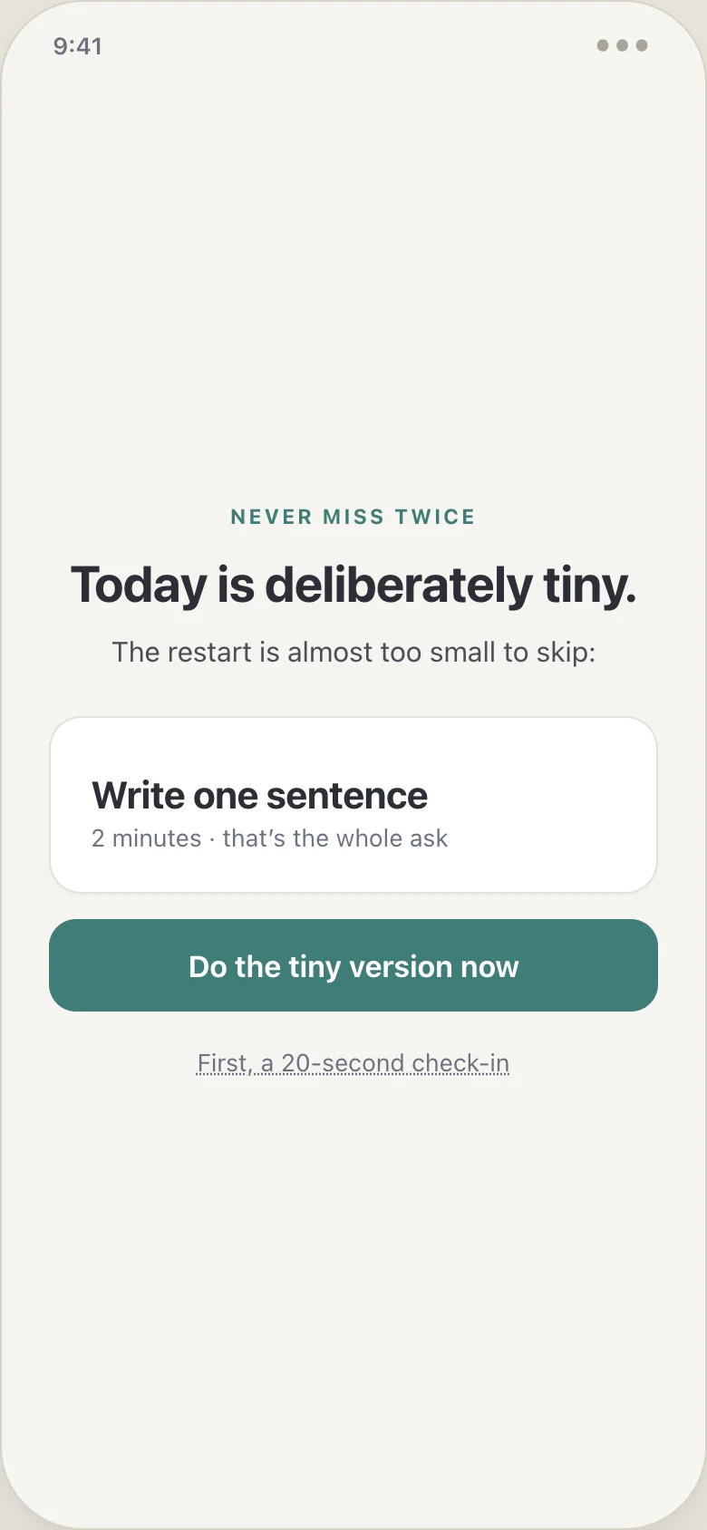
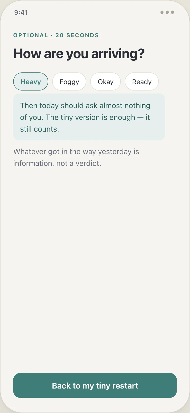
The screen that decides this category’s retention is the one most apps never design: the day after a missed day. Beacon treats the lapse as a first-class flow with three steps. A welcome-back state shows that a grace day was used automatically and nothing was lost. A tiny restart deliberately shrinks the day’s ask (“write one sentence, two minutes”) on the never-miss-twice principle. An optional 20-second check-in asks how you are arriving and answers with mood-matched self-compassion copy, because defusing shame is what keeps someone in the game long enough to reach a long-term goal.
Decision 5
The agent proposes, the user disposes
The AI layer could easily have become the app: auto-scheduling, silent plan rewrites, a stream of nudges. For this audience that is exactly backwards. Trust is the scarce resource, and an agent that acts invisibly reads as one more system telling you what to do. So Beacon’s agent works under four rules, and each one is visible in the interface.
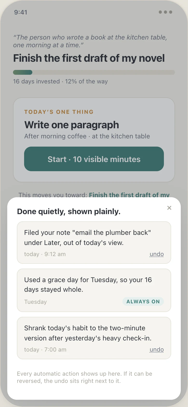
Proposed, not prescribed. Every AI output is a draft. The habit breakdown enters the plan only through the approve button, and every proposal can be shrunk, swapped for different habits, or edited. Reasoning on demand. Each proposed habit carries a plain-language “why this?” tied to the user’s own words, their goal and their named obstacle, never model jargon; it is one tap away, not forced into the flow. Honest provenance. The screen says plainly whether a proposal came from the live model or from the offline sample set. The embed at the end of this page runs on samples and says so; the repo ships a working Claude API integration behind the same approval UX, and no API keys ship to the browser. Visible, reversible autonomy. Everything the agent does on its own, filing brain dumps, spending a grace day, shrinking a habit after a heavy check-in, appears in a “done quietly, shown plainly” log, and every reversible action carries its undo.
The agent is measured by user outcomes, days invested toward the goal, not by engagement with the agent itself. Its success state is that you stop noticing it.
Outcome
This is a working prototype, not a shipped product, and this page will not pretend otherwise: there are no users yet, so there are no usage metrics.
What exists today: a working v1 covering the full happy path (onboarding, daily loop, missed-day re-entry, weekly review), an in-app support chat in the same shame-free voice, and an agentic layer that proposes habits with visible reasoning, labels whether responses are live or sample, and logs every automatic action with an undo. The public build runs on sample responses; the repo ships a working Claude API integration behind the same approval UX.
What I’d measure at launch: day-30 retention against the category’s cliff; reactivation rate after a missed day, the number the forgiveness engine exists to move; median time from install to first completed action, with the design target under two minutes; and brain-dump capture usage, the leading indicator that the app is trusted as an external memory.
Where it goes next
The motivation engine (body doubling, novelty rotation, future-self nudges), real AI decomposition behind the onboarding, and a React Native build. Each addition gets tested against the five laws before it ships.
Try the prototype
This is the full v1 prototype, exactly as built, running in the page. Start at the welcome screen and click through: onboarding takes about two minutes, the demo clock runs fast on purpose, and nothing you do is saved. For a bigger window with shortcuts into each stage, open the prototype full screen.