Product design · B2B payments
Airgas One Time Payment
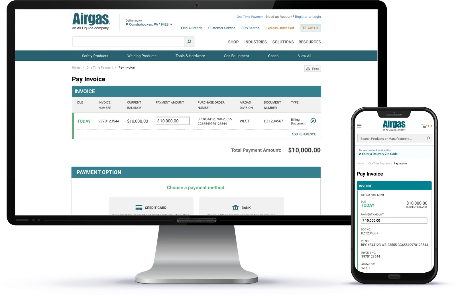
- $368,744 in payments completed within the first month of launch
- Duration
- July – Nov 2024
- My role
- Senior Product Designer; sole designer on the feature
- Team
- 2 PMs and the dev team
- Tools
- Figma
Customers who just wanted to pay one invoice had to log in and navigate a multi-step process. I designed a guest payment flow that pays an invoice without an account, and designed deliberately for the security risk that opening payments to anonymous users creates. $368,744 in payments were completed in the first month after launch.
The problem
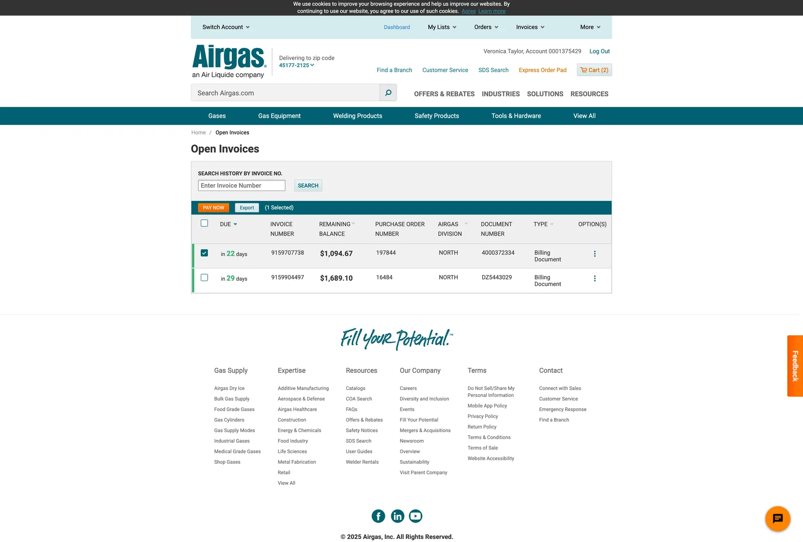
Previously, the only way to pay invoices was a multi-step process requiring the user to login, navigate to “open invoices,” select invoices they would like to pay and initiate the payment process from there. This process created frustration for users that wanted to quickly pay a single invoice.
Decision 1
Invoice details as lightweight authentication
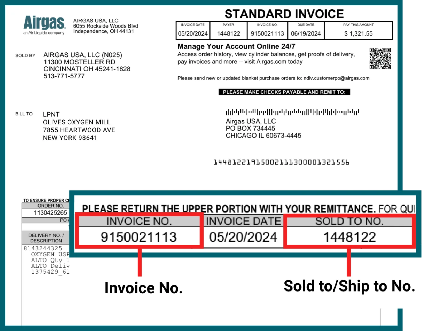
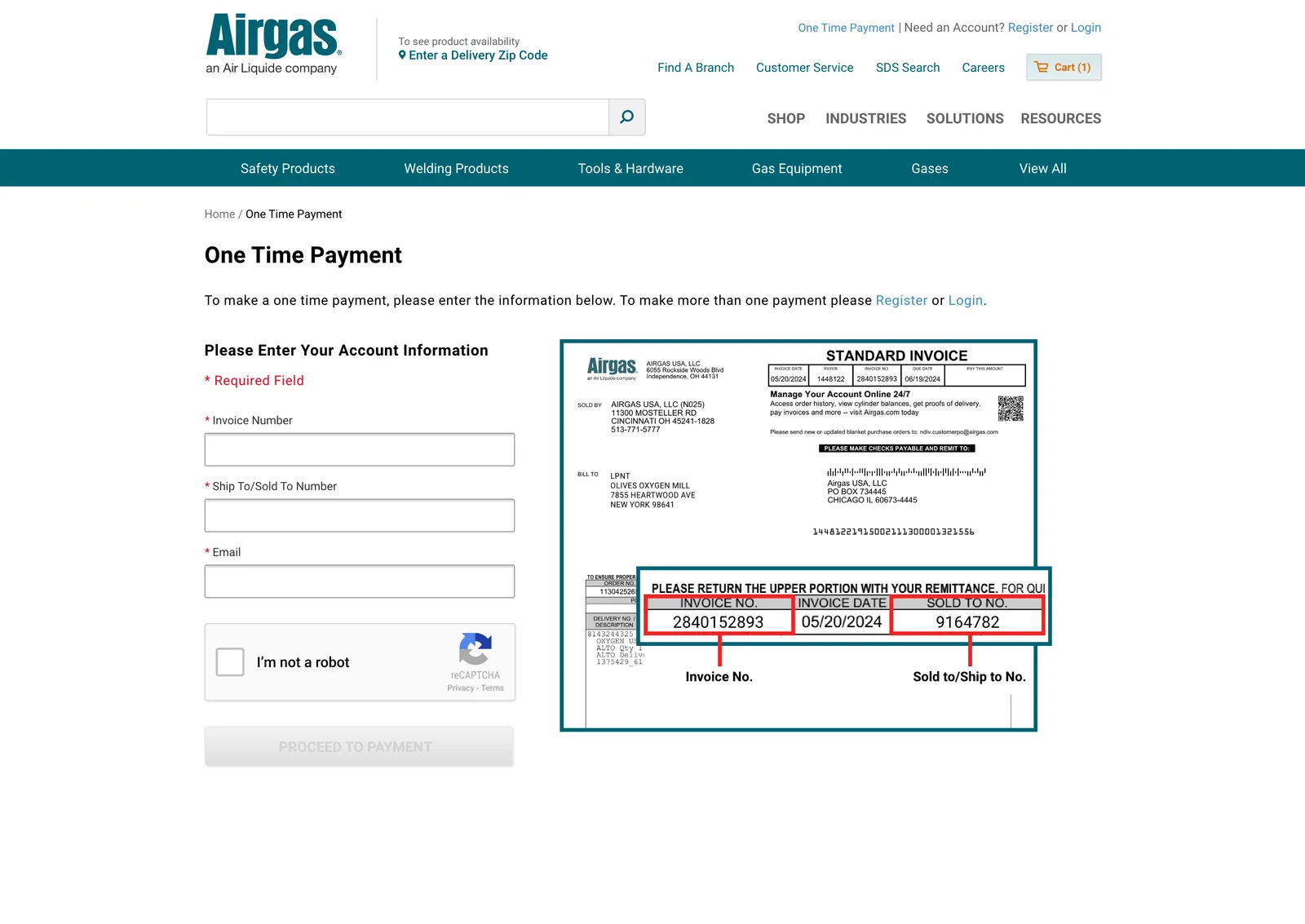
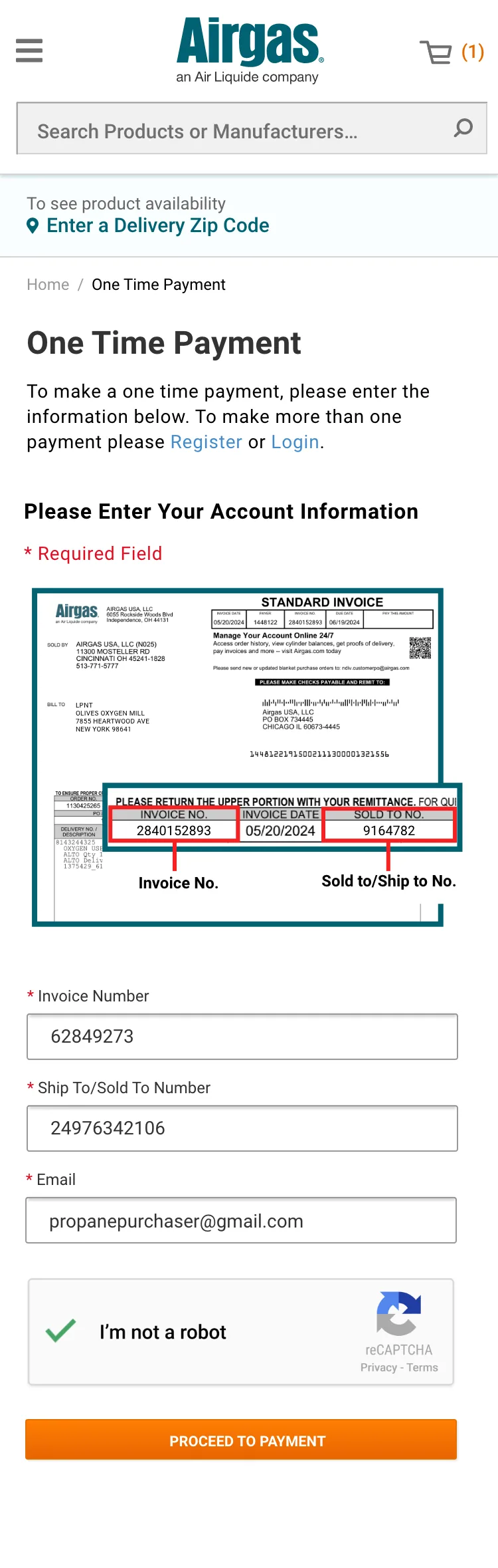
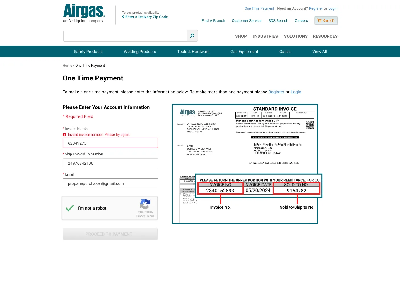
A guest has no login, but they do have the invoice. The flow verifies the payer by matching invoice and account details: enough proof of legitimacy to accept money against the right account, without creating an account. That’s what makes guest payment viable at all.
Finding those numbers is the guest’s whole task, so I made it as easy as possible: an annotated invoice at the entry point that points out exactly where the invoice number and Sold To number live on the paper invoice.
Decision 2
Payments made easy
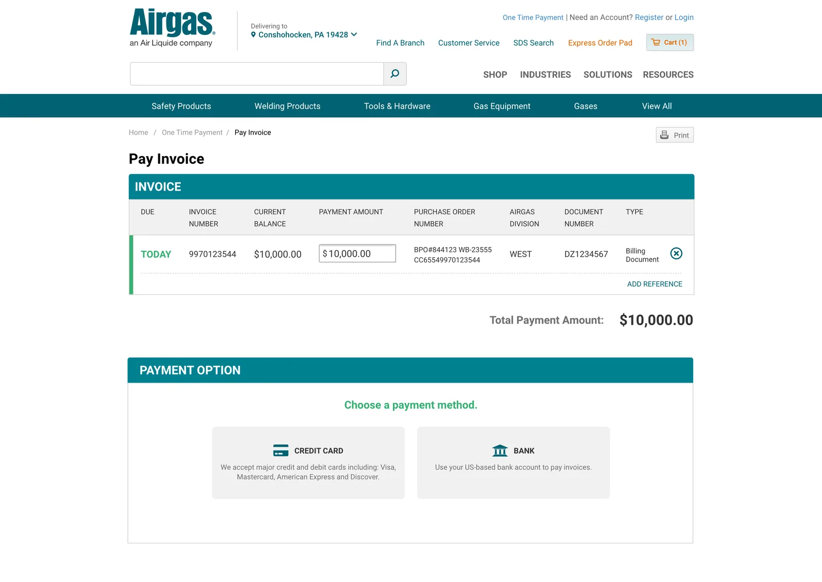
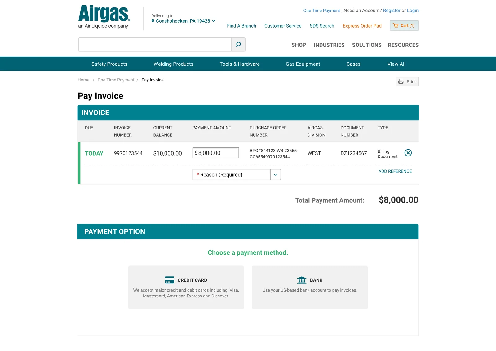
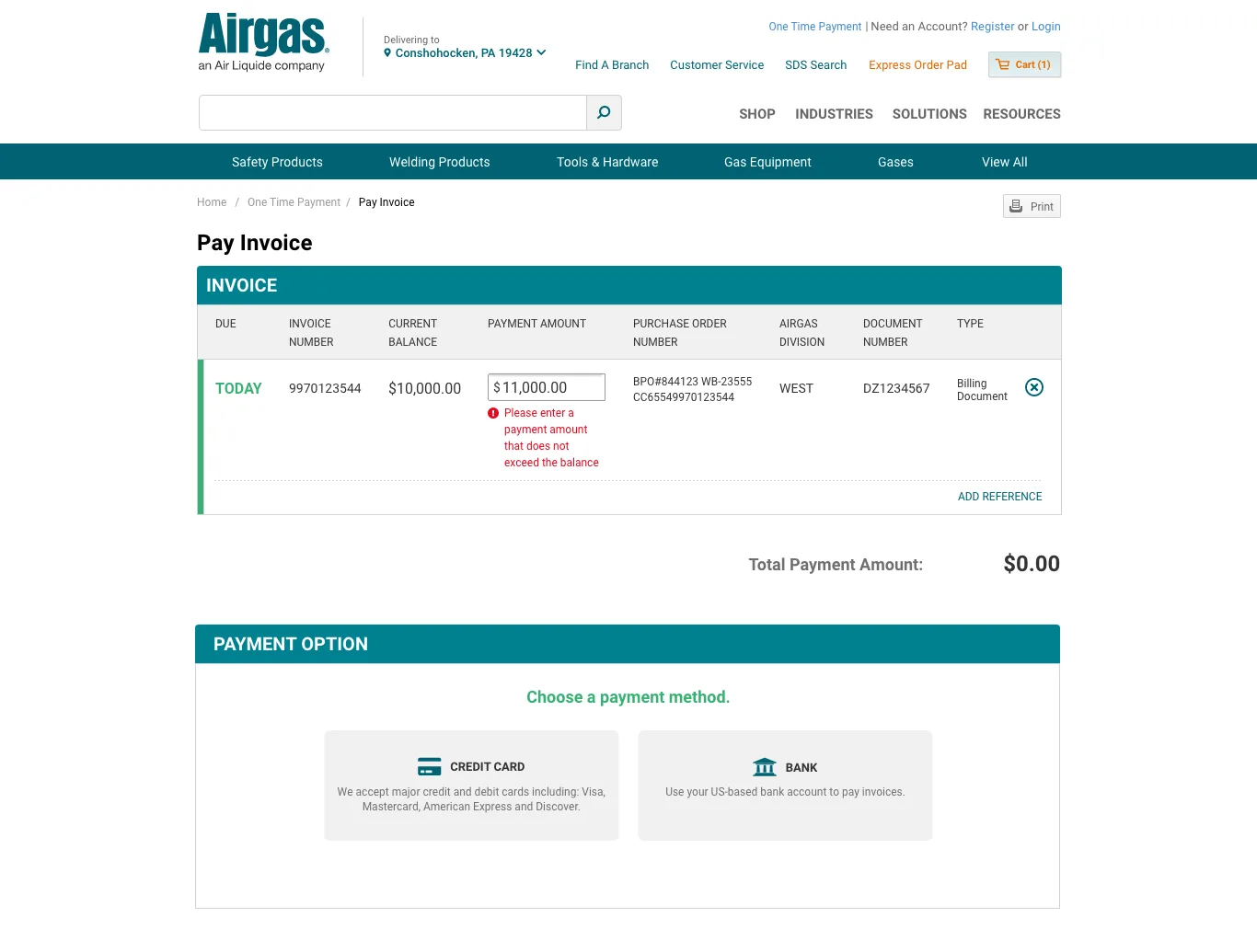
The payment amount is pre-filled with the current balance; the majority case is “pay what I owe.” Partial payment is an explicit option rather than the default, keeping the fast path fast without trapping customers who need to pay less.
The screen itself deliberately mirrors the logged-in payment experience, so paying as a guest feels familiar rather than new.
Decision 3
Entry from the header
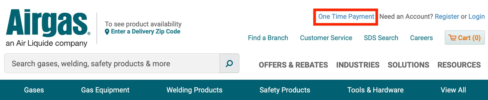
One Time Payment is linked from the site header rather than buried in account navigation, so a guest can reach it from any page without understanding Airgas’s account structure. Discoverability was the argument I made for the header placement, and it proved out: over 50% of users who start a payment enter through the header link on the homepage.
Decision 4
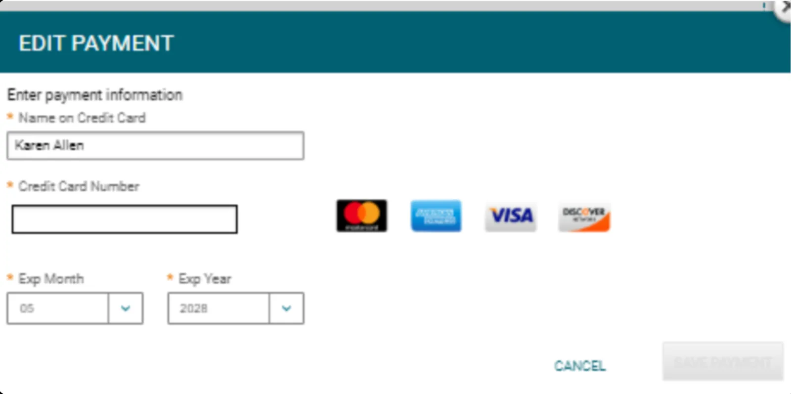
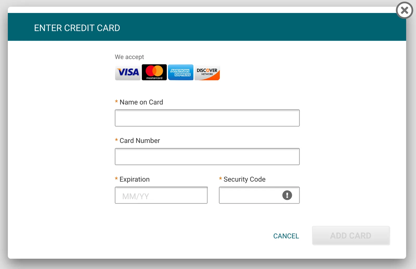
Redesigning payment method component for better security
The payment-method modal predated this project, and it never asked for the card’s security code. Opening payments to the public internet raised the bar on card handling, so I redesigned the modal to require the security code: one small added step for the customer that strengthens the security of every card payment.
Failure states
If the invoice and account details don’t match, the form returns an inline error and the customer can correct and retry; a payment is never initiated against an unverified invoice. Keeping failure recoverable in place mattered here: a guest who hits a dead end has no account to fall back on, so the form is where the problem has to get solved.
The payment step has its own guardrail: an editable amount can exceed the balance, so the form catches it inline, and an invalid amount never counts toward the payment total.
Outcome
$368,744 in payments were completed within the first month of launch.