Product design · Self-service dashboard
WM Customer Dashboard
- Duration
- May – Sept 2023
- My role
- Senior Product Designer, in a pod of 2 product designers + 1 UX designer, with 2 PMs and 2 devs
- Tools
- Sketch, InVision
WM serves 20M+ residential and commercial customers across North America, and its customer service team was absorbing an overwhelming daily volume of calls because the dashboard, the logged-in account surface for those customers, couldn’t answer three basic questions: where is my service, what do I owe, and how do I change things. We redesigned the residential and commercial dashboards around those questions. The dashboard shipped in late 2023; I rolled off at handoff, before post-launch measurement. The honest version of that story is at the end.
The real problem
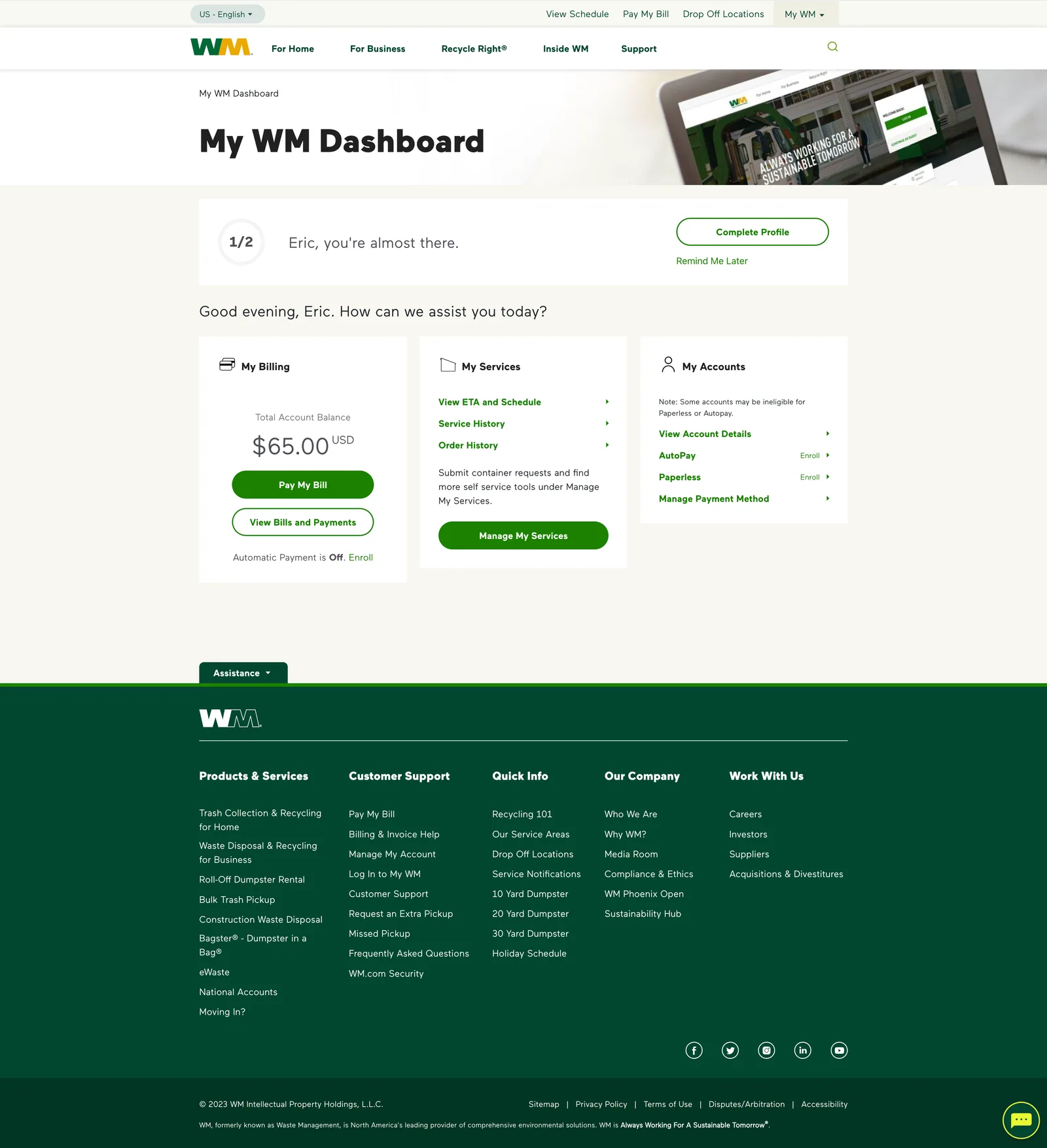
The old dashboard didn’t fail at one thing; it failed at being the place customers checked before picking up the phone. Service status, billing, and account changes each required either a call or a navigation hunt. Every question the dashboard couldn’t answer became a call, and the call center was the company’s most expensive way to answer “was my trash picked up?”
How the team worked
The three designers worked as a shared pod across the whole surface rather than splitting ownership by screen. The decisions below are ones I co-drove within that pod and can speak to end to end, from the constraint that forced them to the screens they produced.
Decision 1
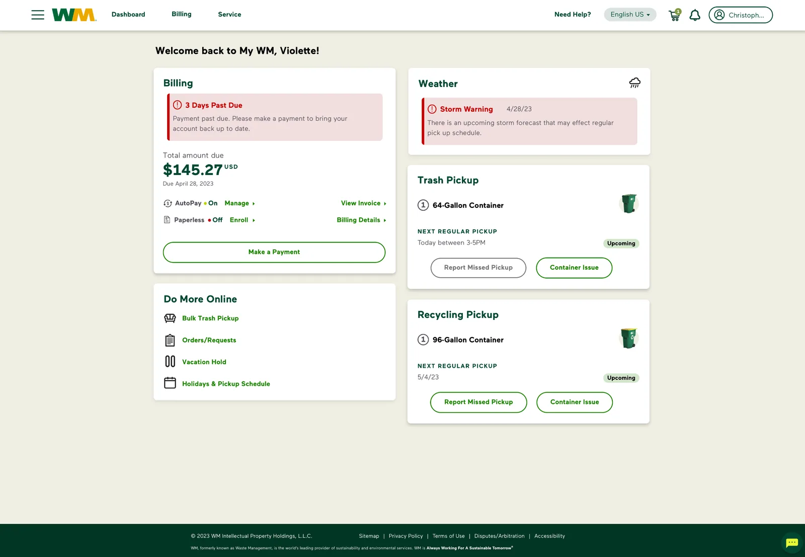
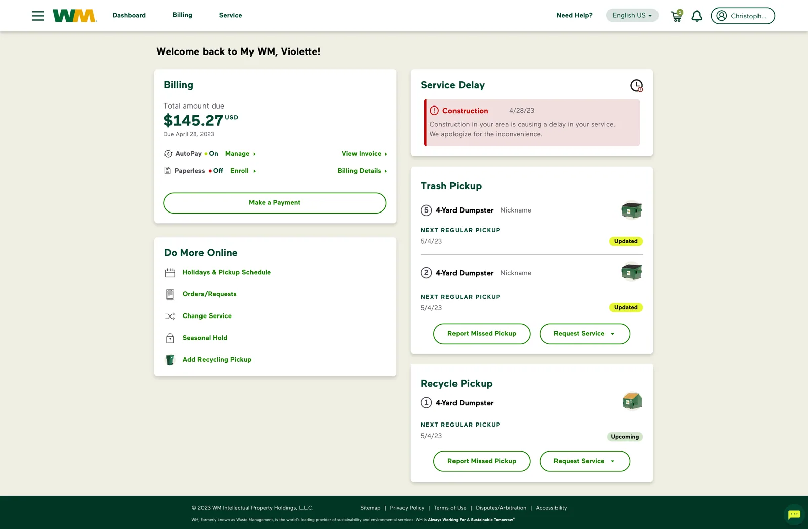
Two dashboards, not one
Residential and commercial customers looked similar on paper and diverged everywhere it mattered: a homeowner has one service and needs vacation holds; a business manages multiple dumpsters, seasonal holds, and service changes across locations. Forcing both through one layout meant burying commercial complexity or cluttering the residential view. We split them: shared components, different information hierarchy.
Decision 2
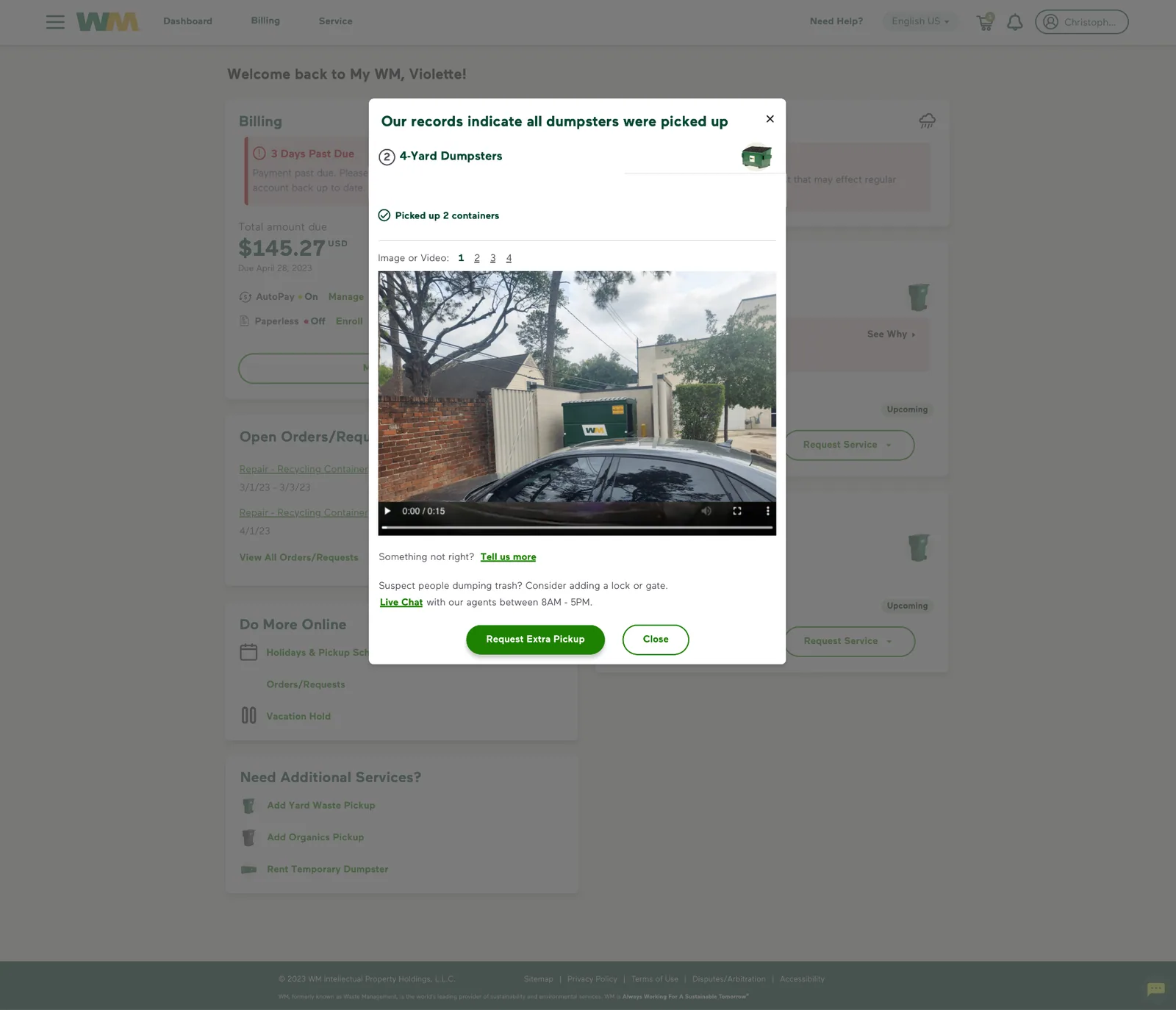
Answer the call drivers on the dashboard itself
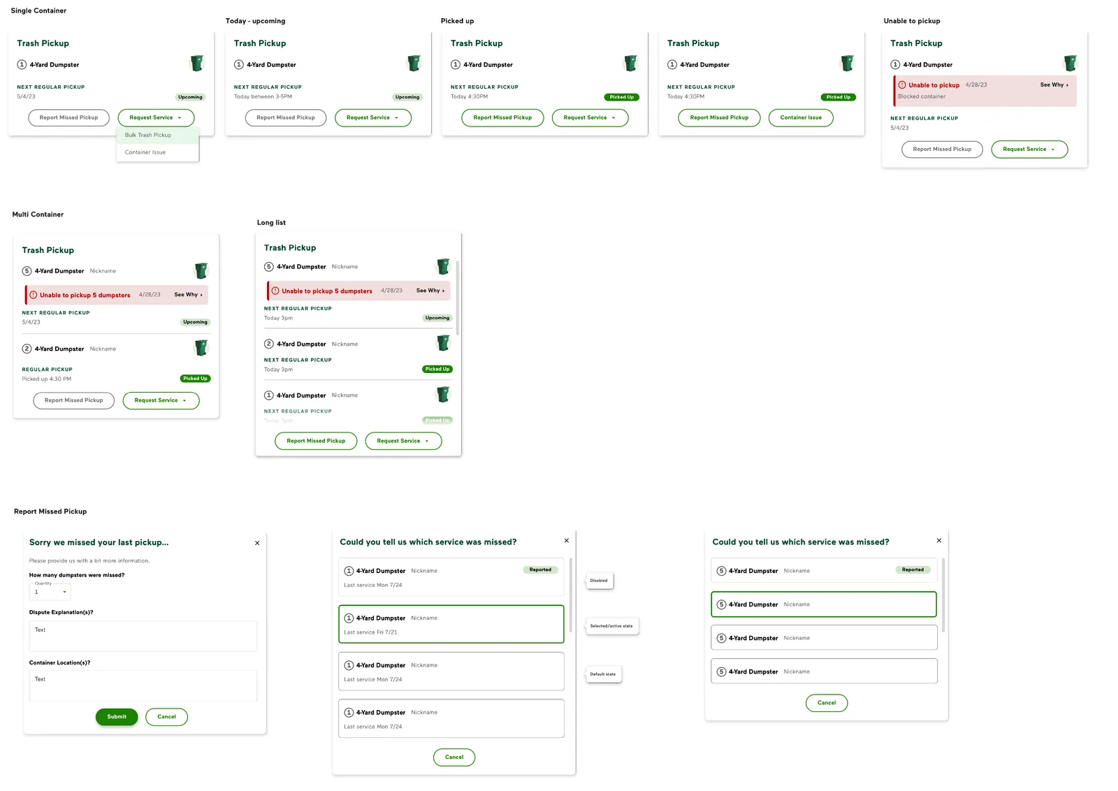
The redesign put service status front and center as cards with progressive detail: click through for full service information, including camera footage of pickups. The design goal was explicit: the top reasons customers called should be answerable from the first screen. Same logic drove quick links for FAQs, holiday schedules, and service alerts.
Decision 3
Extending the design system instead of fighting it
Much of this functionality was new to WM, so no components existed for it. We designed custom components that stayed consistent with WM’s design system (new patterns, recognizably WM) rather than inventing a parallel visual language the org would have to maintain.
Process
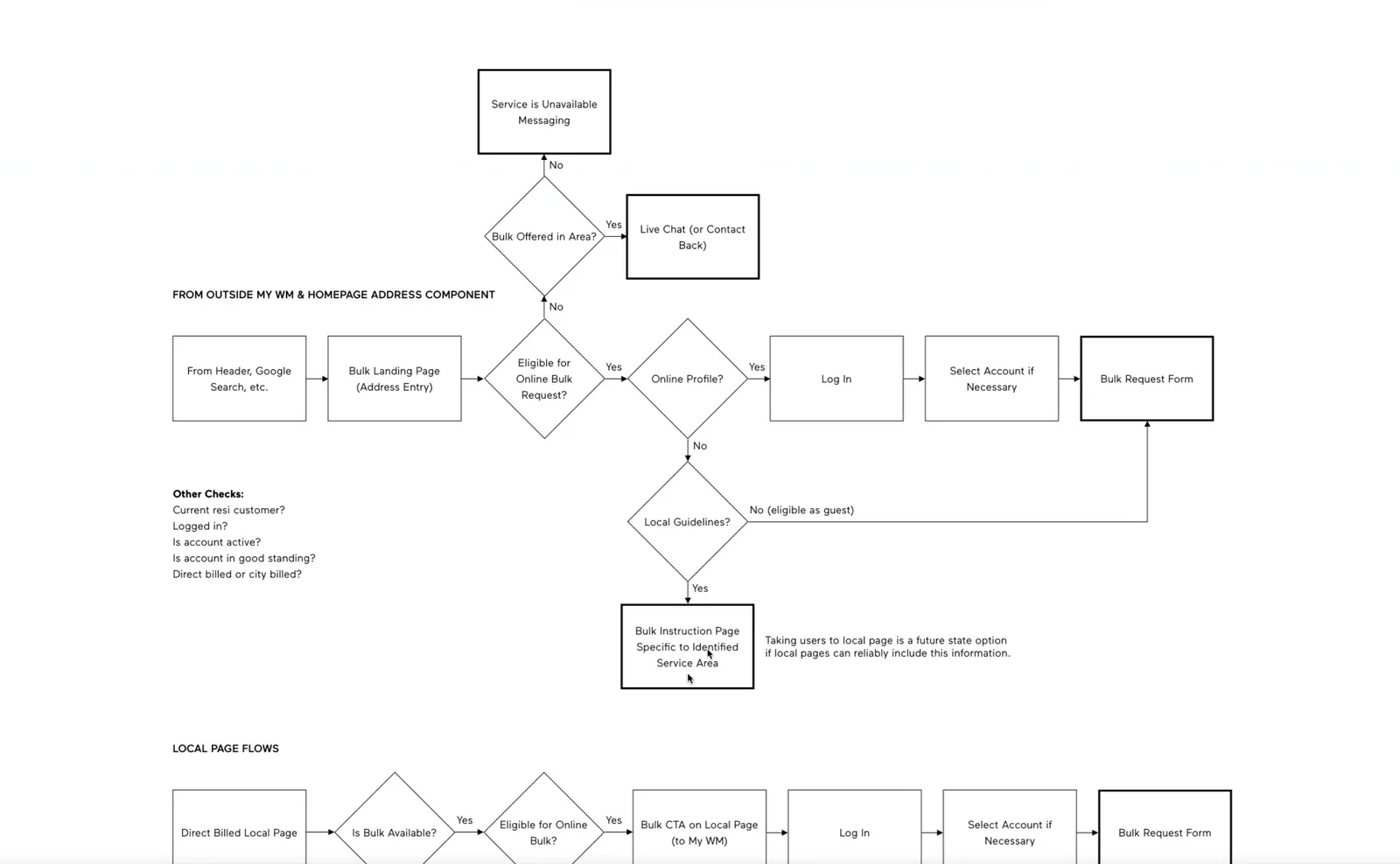
Sitemap and IA to establish the flows, wireframes with the UX designer, then visual design and components. Earlier iterations explored different treatments before the final direction.

Outcome: the honest version
The redesigned dashboard shipped to WM’s residential and commercial customers in late 2023. I rolled off at handoff in September 2023, before post-launch measurement, so I can’t report what happened to call volume, and I’d rather say that than imply a number.
What I would have instrumented, given that the whole project existed to deflect calls: service-status lookups that complete without a call, vacation-hold and seasonal-hold self-service completion rates, and repeat-call rate on billing questions.
What I’d do differently: define those metrics with the PM before design started, not after. That gap is the biggest lesson I took into the Airgas payments work, where I made sure the analytics funnel existed at launch.