UX design · Internal tools
Salesforce GSA Toolkit
- 100% of guest service ambassadors reported the redesigned toolkit was significantly more user-friendly (post-launch user testing)
- Duration
- April – July 2022 (12 weeks)
- My role
- Lead UX Designer; research, design, and testing, working with a second designer, 2 content designers, and 1 PM
- Tools
- Figma, Photoshop, Mural, Google Sites
Guest Service Ambassadors at Salesforce HQ assist ~15,000 employees, guests, and public-park visitors a month across a campus of three towers (61, 43, and 30 floors), and the site they depended on daily was one most ambassadors described as unusable in our initial research. I led a research-driven redesign through two tested iterations.
The real problem
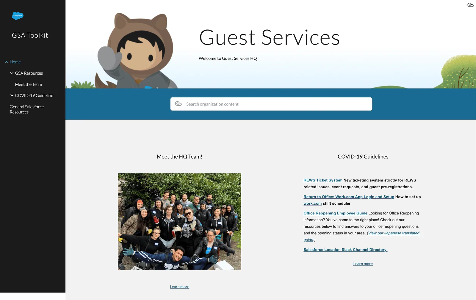
GSAs answer campus questions in real time: floors, amenities, events, contacts, ever-changing policies. Their toolkit buried campus information below the fold and behind confusing navigation, and the building pages were walls of text. When the tool of record is slower than asking a colleague, it stops being the tool of record: turnaround slowed, ambassadors improvised other resources, and employees waited.
Research
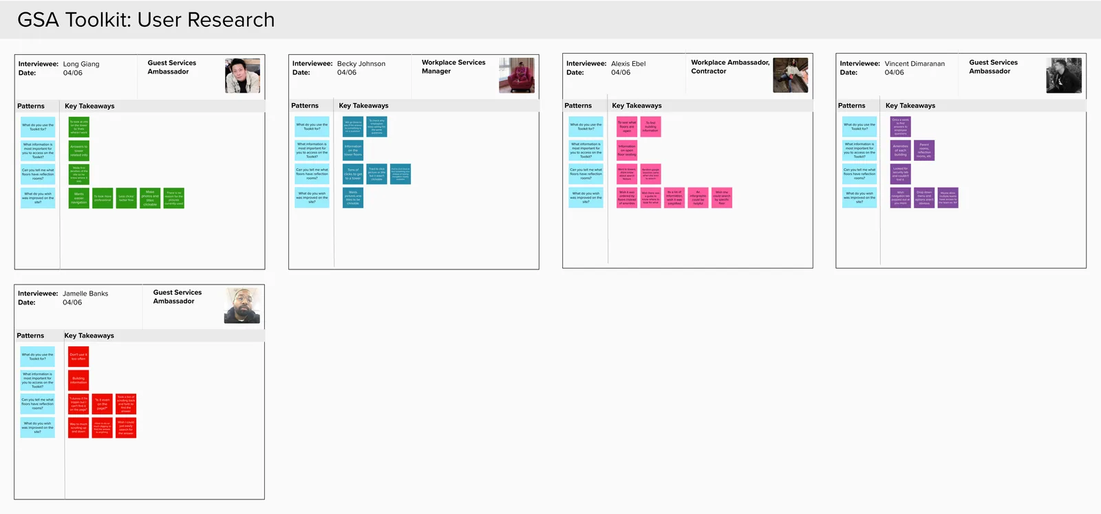
I interviewed GSAs about what they needed the toolkit for most, where it failed them, and how they actually worked around it. Synthesis pointed at three failures: the most-needed information (campus/building info) had the least visibility, navigation demanded too much digging, and pages weren’t scannable under time pressure.
Iteration 1: One click to any building
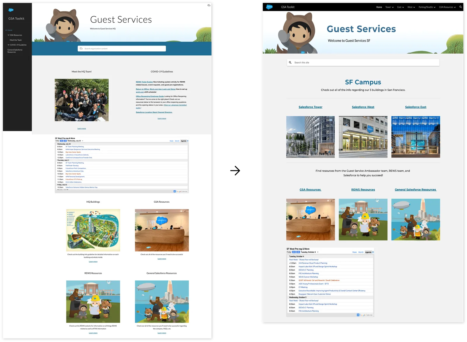
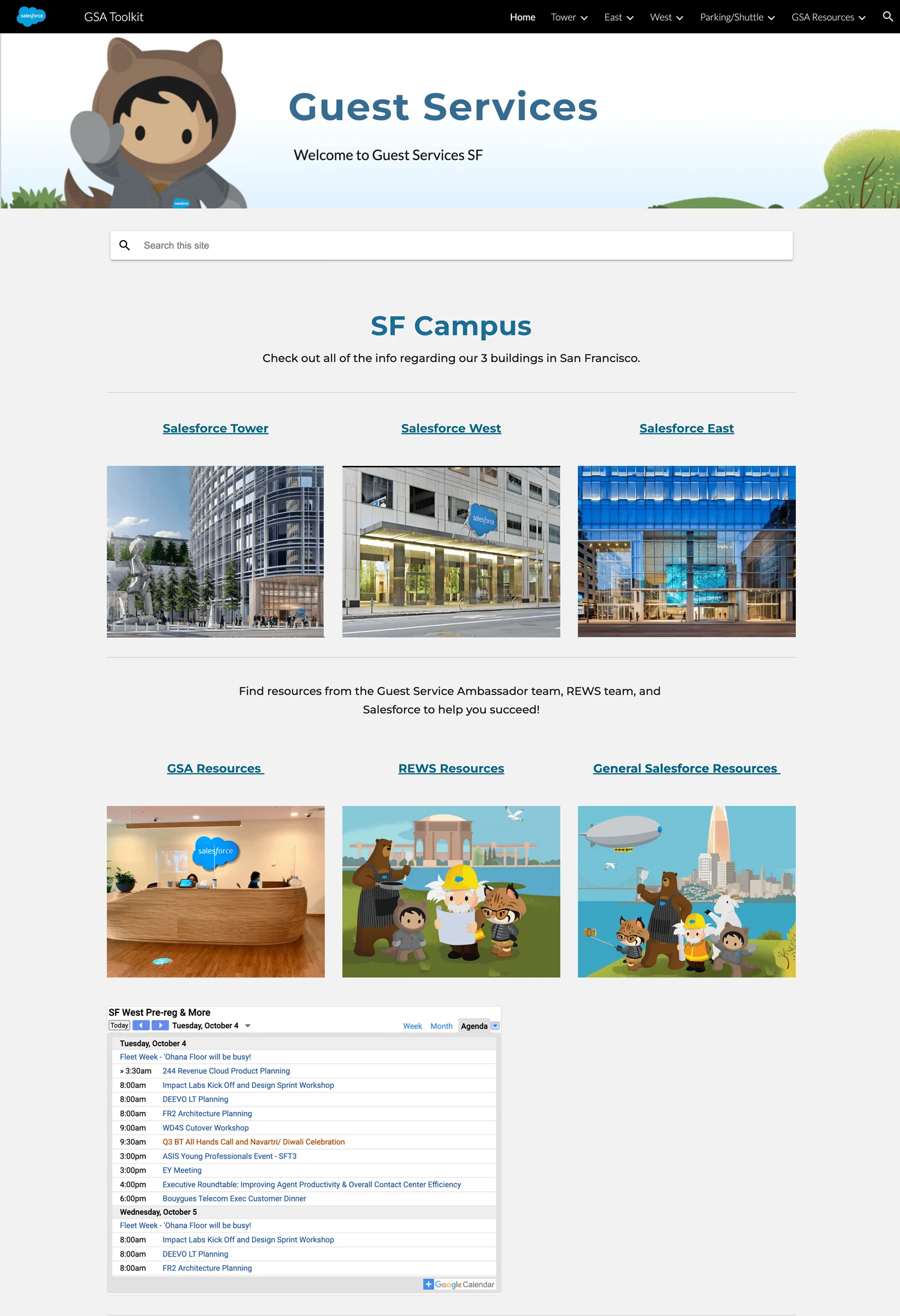
The V1 redesign made each building’s information reachable in one click from the home page, broke tower pages into labeled sections instead of long lists, and consolidated scattered resource links into categories with recognizable icons.
Iteration 2: Tested, then restructured
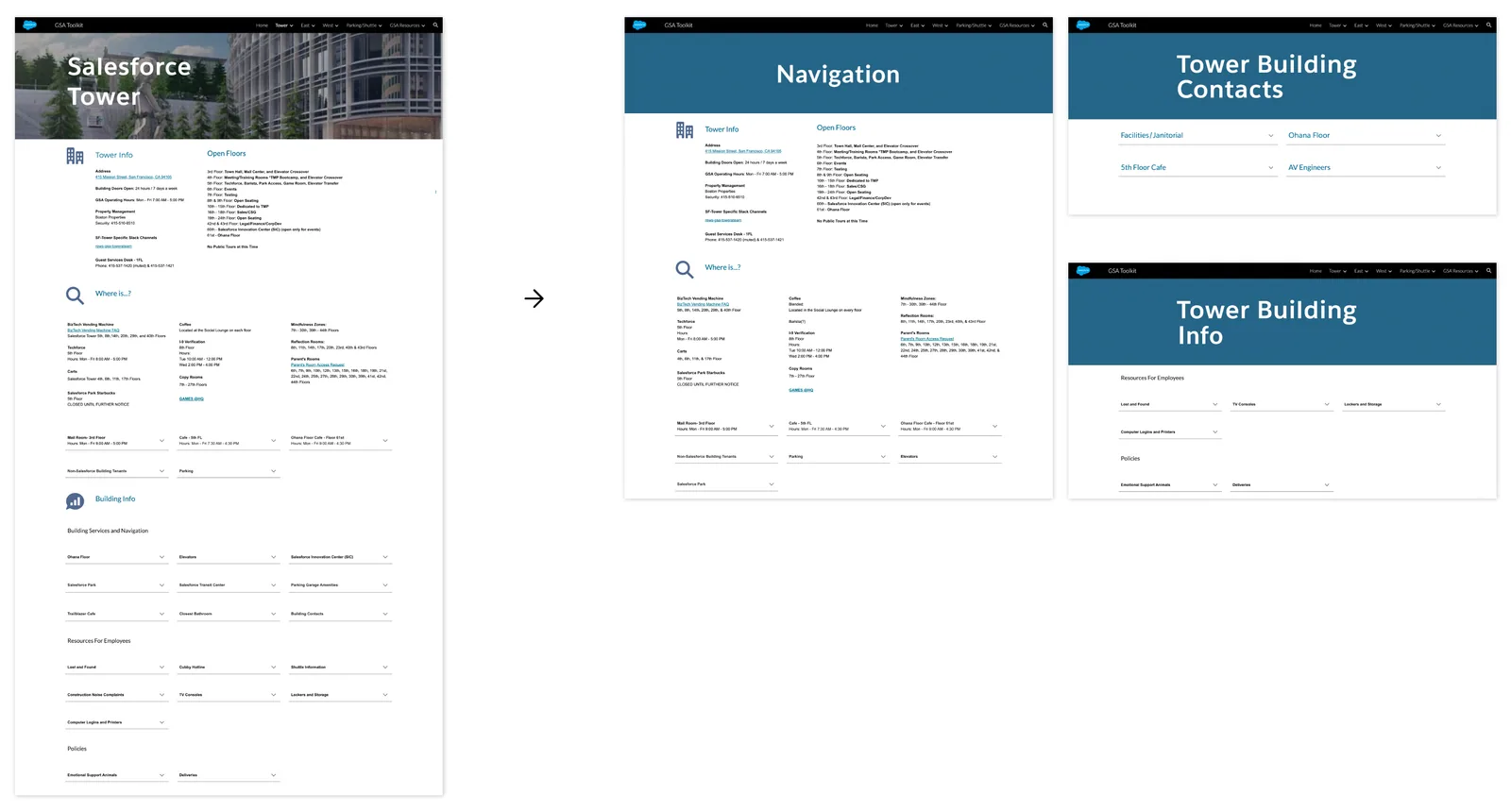
8 GSAs user-tested V1. Navigation and visual clarity scored better, but testers said building pages needed to be broken down further. V2 split each building’s content into sub-pages, trading a click for much faster scanning. That trade came directly from watching ambassadors work, not from a heuristic.
What shipped
The toolkit used at Salesforce HQ: search, prioritized campus/GSA information, an event calendar covering all three buildings, and a categorized resources page for at-the-desk tasks, onboarding, and key contacts.
Outcome
In post-launch user testing, 100% of guest service ambassadors reported the redesigned toolkit was significantly more user-friendly and that daily tasks got faster.
“I’ve been able to answer employee’s questions quickly and easily, even as a new hire.”
What I’d measure today: time-to-answer for the most common questions, before and after. That’s the metric the whole redesign existed to move.