Product design · B2B & B2C payments
Airgas Autopay
- 10,000 accounts enrolled in the first month after launch
- 90% of customers who initiated enrollment completed sign up
- Duration
- Oct 2024 – June 2025
- My role
- Senior Product Designer, owning design end to end from scoping through launch
- Team
- 1 PM and the dev team
- Tools
- Figma
Airgas customers could only enroll in autopay through a manual SAP process: printed forms, mailed or faxed. I designed a self-service enrollment experience for two very different user types. In the first month after launch, 10,000 accounts enrolled, and 90% of customers who started enrollment completed it.
The Problem
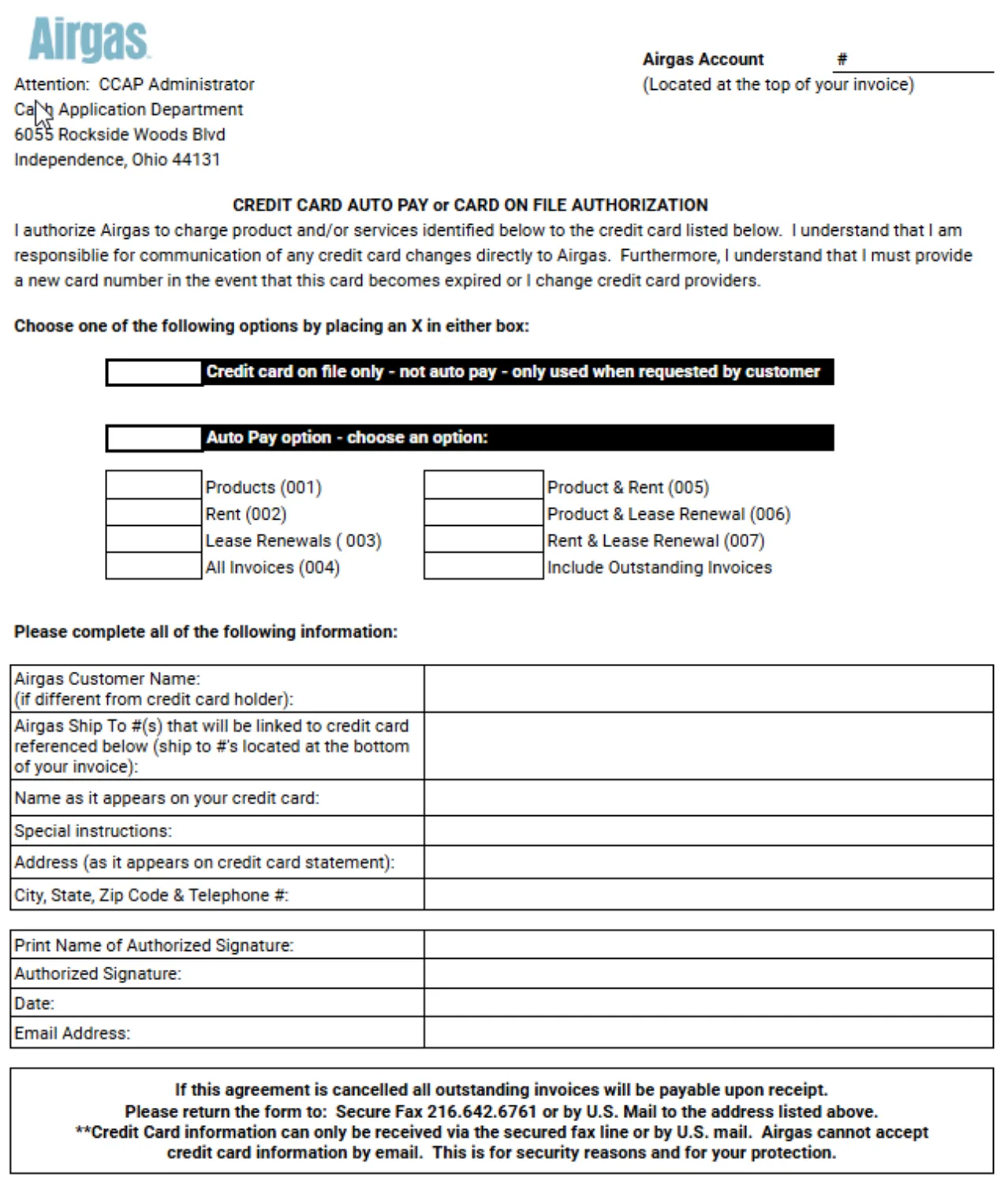
Autopay enrollment lived entirely outside the product. Customers filled out paper forms and mailed or faxed them to be processed manually in SAP. Every enrollment cost the customer days and cost Airgas manual processing work.
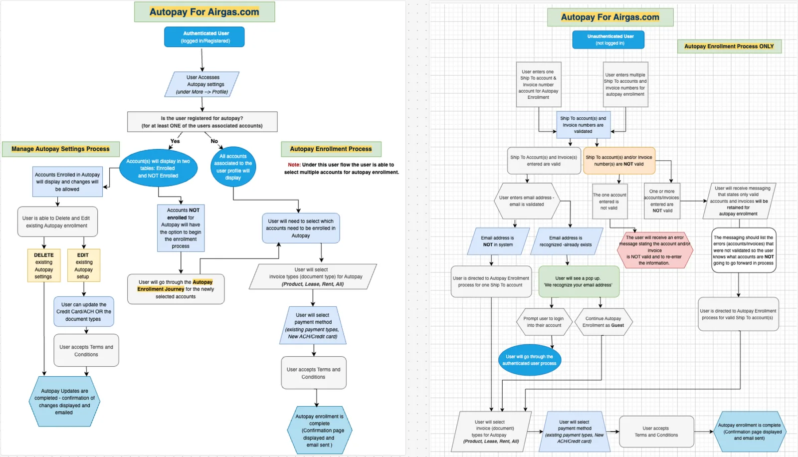
Enrollment had to work for two fundamentally different users: authenticated customers managing many accounts, and guests enrolling a single account without logging in.
During scoping, I used Gemini to synthesize our meeting decisions into a guest-vs-authenticated feature matrix. That matrix became the checklist we scoped v1 against and settled which capabilities each user type actually needed.
Decision 1
Authenticated vs. Guest Users
We split guest and authenticated enrollment into separate experiences. A single flow would have forced a compromise on both sides; splitting let the guest path stay minimal (enter account info, enroll, done) while the authenticated path got real multi-account management.
Decision 2
Full-screen over modals
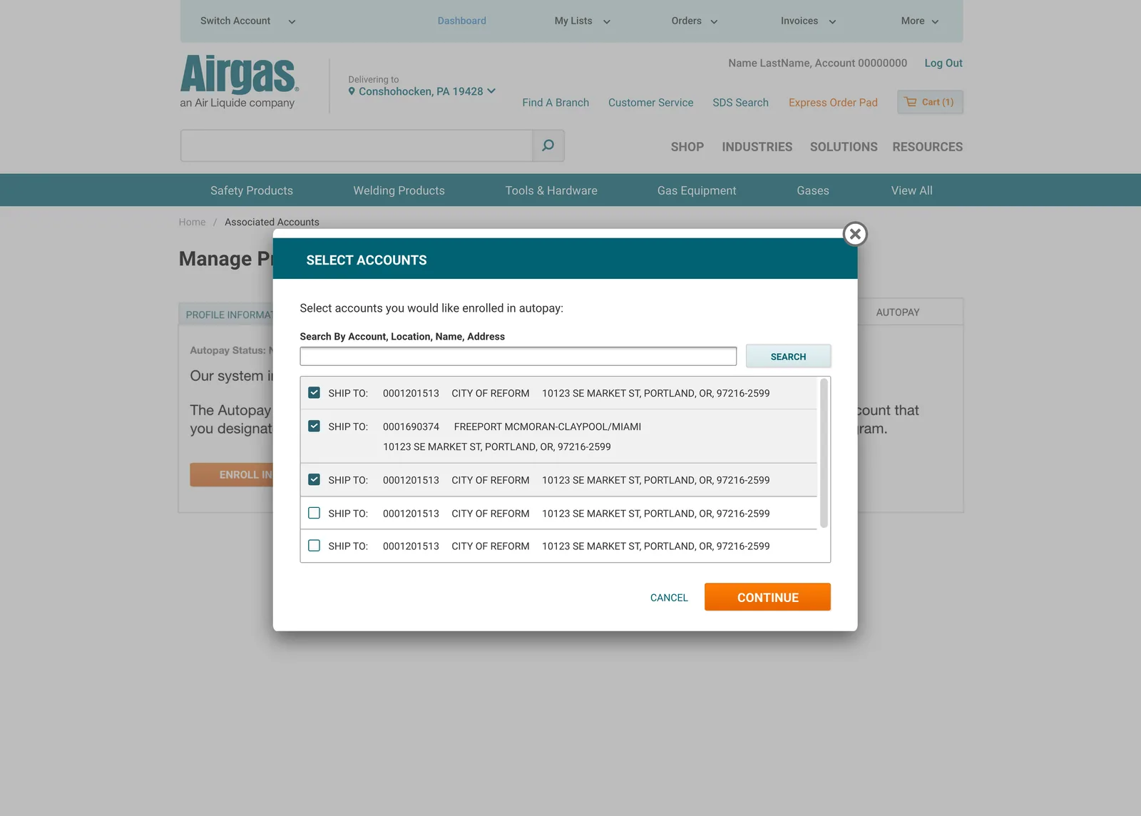
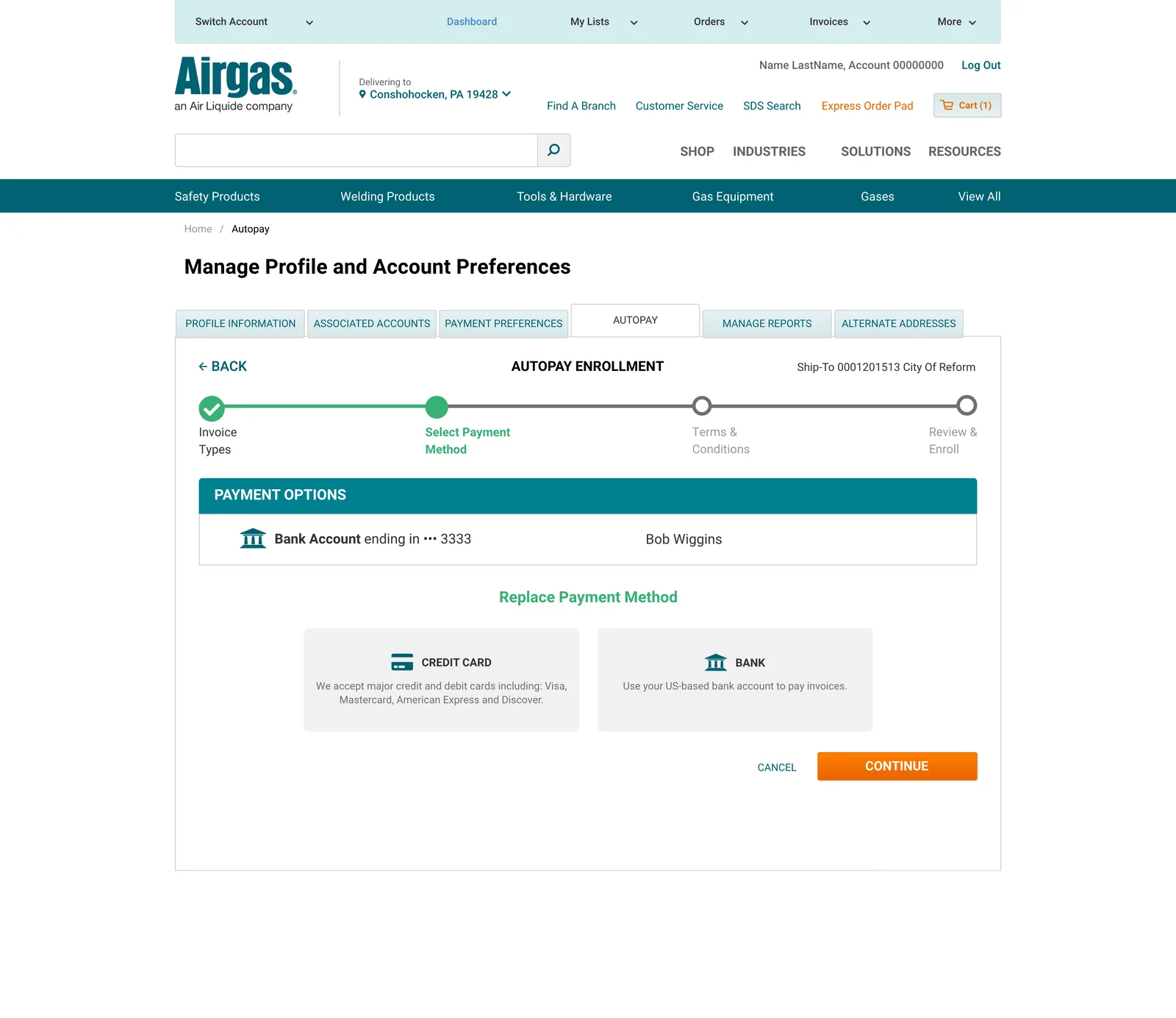
The initial flow ran entirely in pop-up screens. Two things broke as we tested it against real account structures: the edge case of customers with hundreds of accounts couldn’t see enough account context inside a modal to know what they were enrolling, and the multi-step flow gave no sense of progress; users couldn’t tell where they were or how much was left. I moved enrollment to a full-screen, stepped experience with persistent account context and visible progress.
Decision 3
Losing the dual-table view
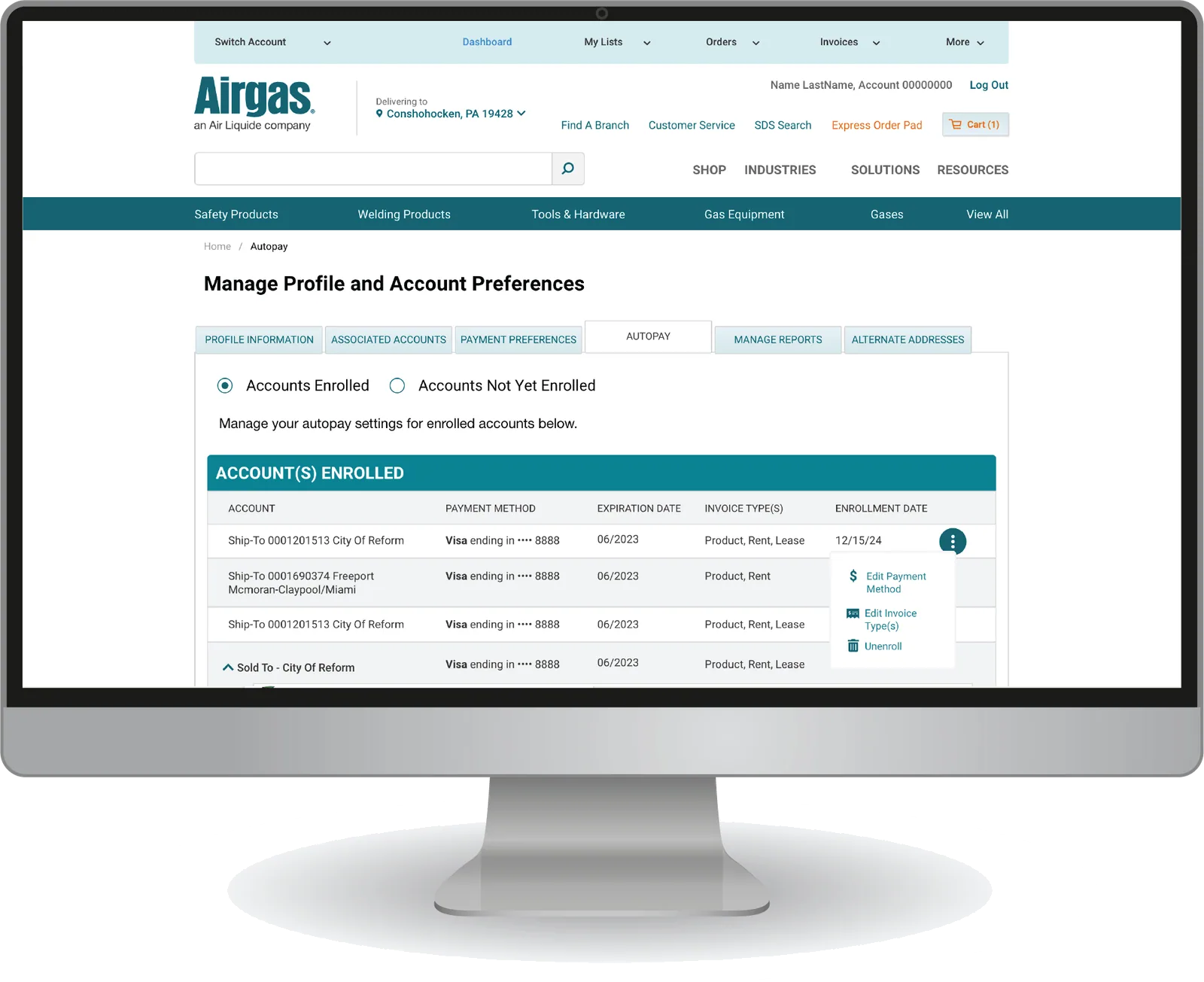
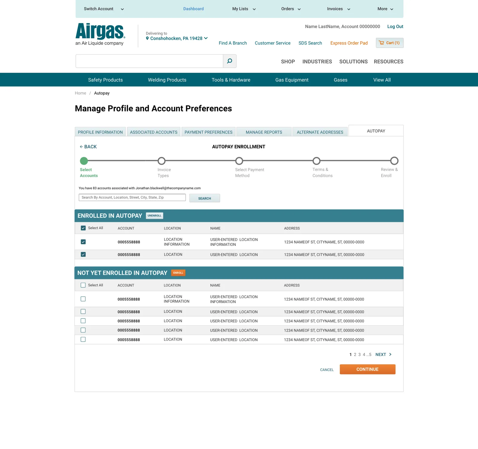
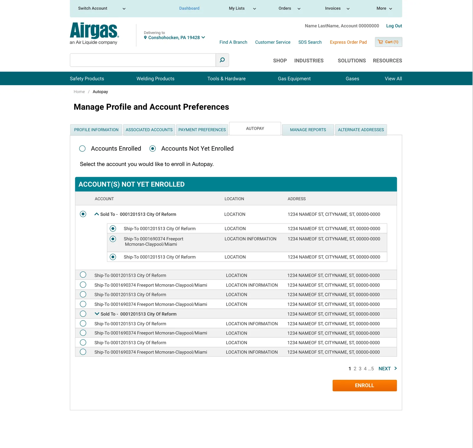
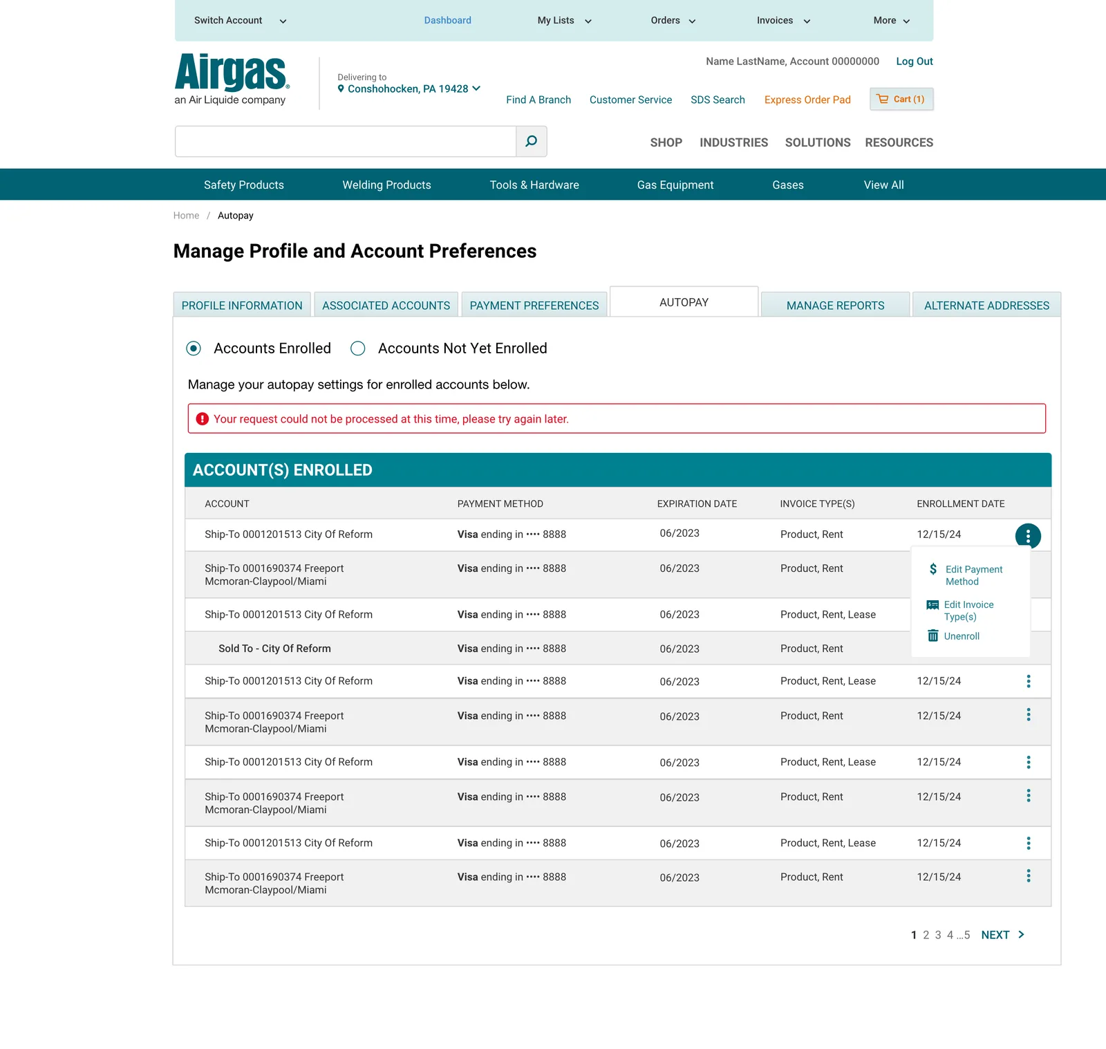
I wanted enrolled and unenrolled accounts visible side by side, so customers could compare and act in one view. Engineering found the dual-table design technically infeasible; the way enrollment data lived in SAP couldn’t support the combined view. Rather than ship a degraded version of it, the final design preserves the need with tabbed views: customers switch between Enrolled and Not Enrolled on the same screen, so the compare-and-act loop survives even though the side-by-side layout didn’t.
The switcher itself uses radio buttons rather than literal tabs to maintain consistency: features in the other tabs of the same screen already use radio buttons for this kind of switching.
Easily Edit Autopay Settings
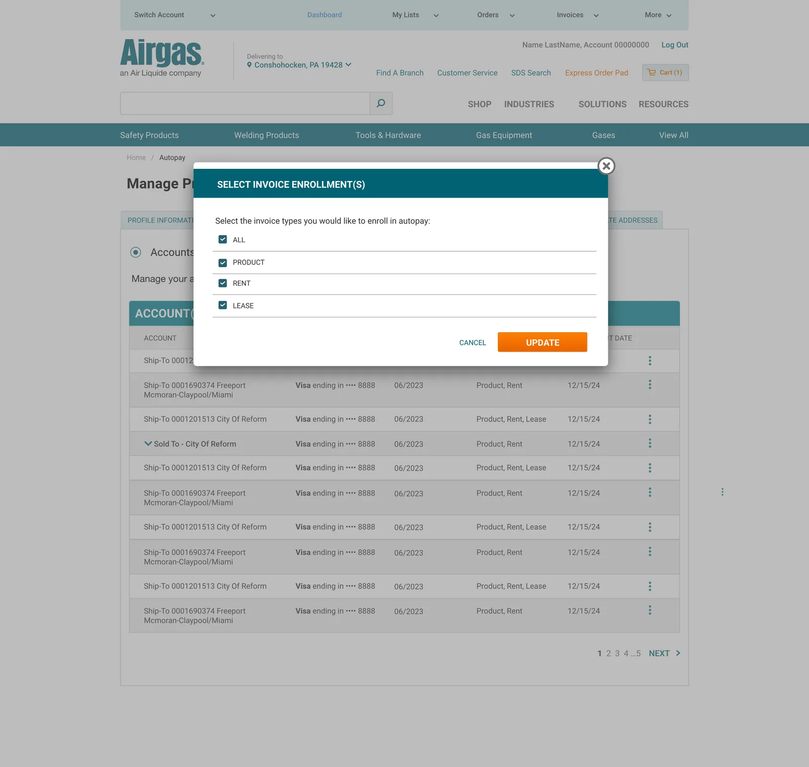
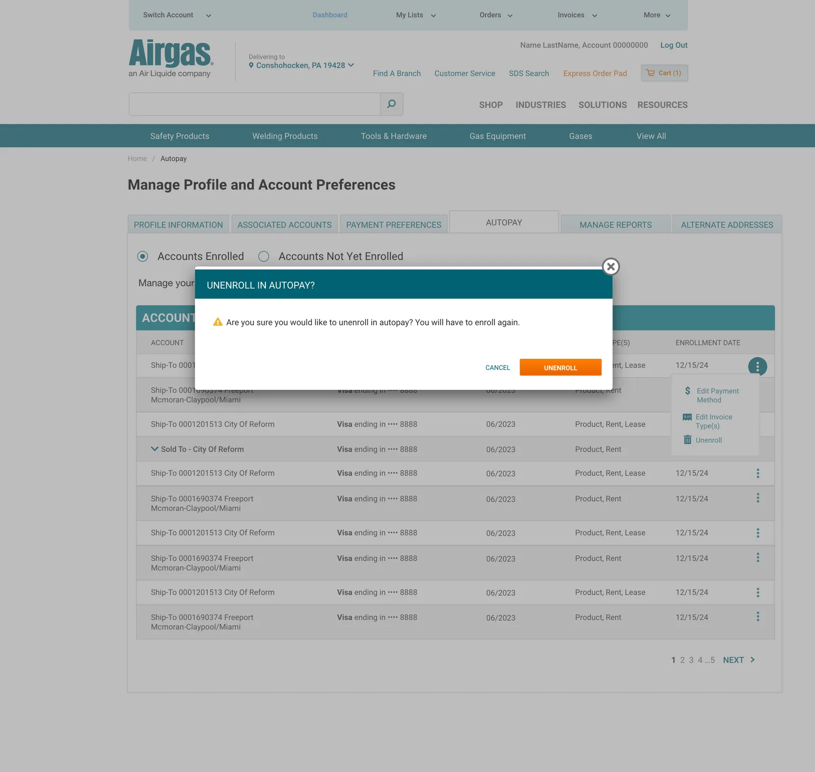
Enrollment isn’t a one-time event, so the design covers the full lifecycle. Customers can change invoice enrollment type, swap payment methods, and unenroll accounts at any time.
Failure and edge states
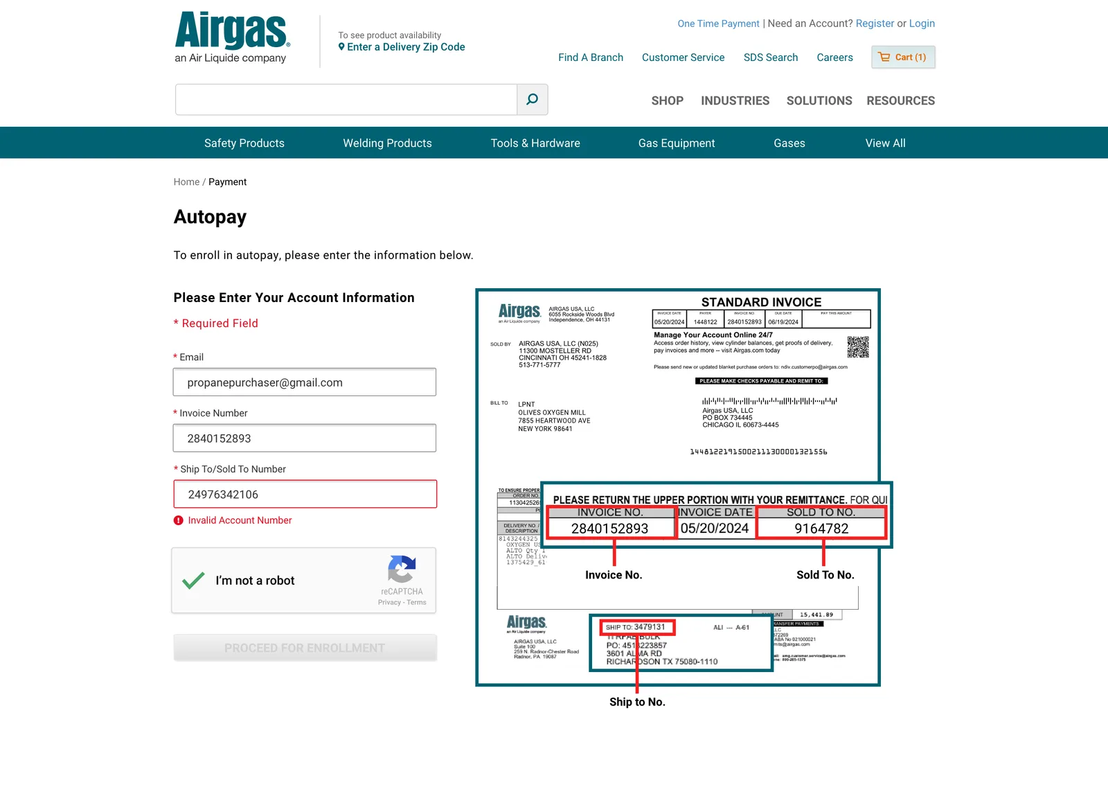
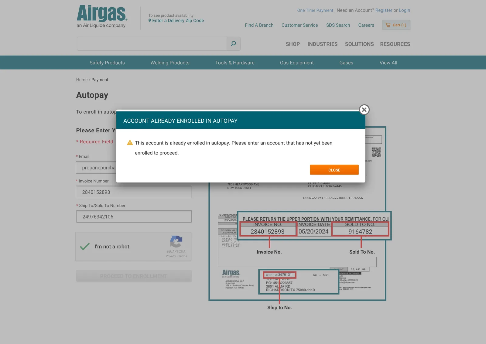
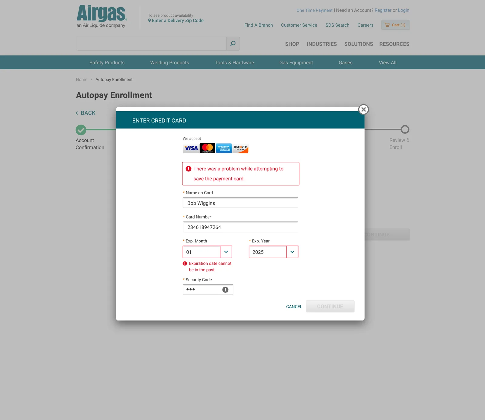
Autopay touches saved payment methods on real accounts, so the design covers the states between the happy paths: invalid entries, duplicate enrollments, consequential actions, expiring cards, and the system itself failing. Each state is specific about what went wrong and what happens next.

Outcome
- 10,000 accounts enrolled in the first month after launch.
- 90% completion rate: of customers who started enrollment, 90% reached the confirmation screen (measured via the enrollment analytics funnel).
What I’d watch next: failed-payment and card-decline rates, unenrollment within 90 days, and support contact volume on payment issues. These are the numbers that would tell us whether enrollment converted into durable self-service.